Burr and Burton Academy
GRAPHIC DESIGN
Burr and Burton Academy
GRAPHIC DESIGN
FLASHBACK
REMEMBER THAT BUSINESS CARD YOU CREATED IN UNIT 2?
You need to use the tools that you just practiced above to create that business card.
Think about the colors you used before (if you did) the arrangement of the elements and the principles so that your card is well rounded and shows good graphic design concepts.
Once you have completed the design, Export it as a PNG file and post it to your portfolio.
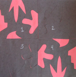
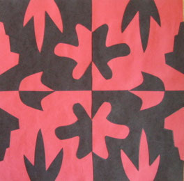
In the style of Japanese Notan Art (Examples)
You will create a design using positive and negative space.
 1.
Start with two 9" squares of construction paper in contrasting colors. (Here
I’m using black and red.) Choose one color to be the background and set it aside.
1.
Start with two 9" squares of construction paper in contrasting colors. (Here
I’m using black and red.) Choose one color to be the background and set it aside.
2. Fold the other square in half vertically and then in half again horizontally.
3. Draw one large shape on each side of your folded square. Each shape should be different and none of them should touch or overlap. (Have teacher check before
you cut!) 4.
Cut out the shapes you drew and save all the pieces!
4.
Cut out the shapes you drew and save all the pieces!
5.
Now, open up your paper and lay it flat. Label the sections 1, 2, 3 and 4, from left to right, top to bottom.
6. Then, cut your four sections apart. Glue #1 and #4 in place (across from each other diagonally) on the contrasting paper. These sections are now finished!
7.
Next, lay sections #2 and #3 in place, but do not glue them down! Place the  cut-out
shapes where they go – no glue yet!
cut-out
shapes where they go – no glue yet!
8.
Carefully, lift off the main pieces and then glue the smaller shapes in place
on section #2 and #3. You’re done!
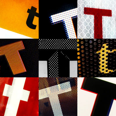
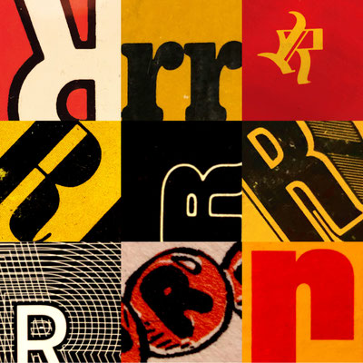
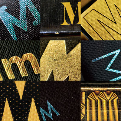
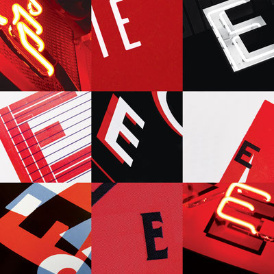
Letter Search
PROJECT BRIEF
Working with one of your initials (first or last name), document at least 25 examples of a single letterform in the environment. Use the basic principles of composition and photography—proper exposure, focus, asymmetry, rule of thirds etc. Combine your best nine images into a 3 × 3 matrix. Each image should be cropped into a 2.5 inch box. Your final set of nine photos should be create a composition that is 7.5 × 7.5 inches, with no gaps between images. Find different type styles including uppercase, lowercase, italics, bold, serif, sans serif, etc. Crop each letterform to create a dynamic composition. Try taking the letterform to just before the point where it is no longer recognizable as a character. (We should be able to tell what letter it is). Consider how the individual compositions work together as a series. Pay attention to color relationships, the individual cropping and the scale of the letters themselves. Think unity and variety: what will unify your nine images (material, size, color, type case etc) and what will provide variety? It’s doubtful you can find 25+ individual letterforms. Photograph words that you can then crop to emphasize a particular letter. Your photos should be high quality—no pixilation or unintended blurriness. Shoot at a high resolution—the final images should be 300dpi at 100% size.
LEARNING OBJECTIVES
This project will sensitize you to the varied styles of letterforms in the built environment and encourage you to examine the distinct characteristics of individual characters. This project will also help refine your photography skills and your continued appreciation for color and composition. Being able to work with images is a critical skill for any designer. These should be original photographs. Do not download images from Flickr or any other image site. If asked, you should be able to tell us where each photo was taken.
DELIVERABLES
Print the final composition on 8.5 × 11 inch page, portrait orientation, Epson paper recommended.
REFLECTIONS
This is a useful way to start the winter quarter since the students (60 sophomores majoring in ID, IxD and VCD) just completed a Color + Composition class in the fall. Rather than get on the computer straight away, we use this assignment as a one week warmup (one critique only). It is a good way to reinforce color and photography principles covered in the previous course. And it is an effective way to begin discussions on closure (gestalt principle) and letterform anatomy. I have run this project with 16 and even 25 images in a grid. Those tend to be busier compositions though. For a one week project, nine images works pretty well.
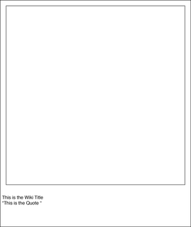
Mystery Band Album Cover
I’m challenging you to think on the fly, and develop an interesting solution to the problem presented.” Here are the rules:
The final image (album cover) must be cropped to 7.5"x7.5" inches. However your Art board needs to be 9.5in tall by 8in wide. In RGB format
The bottom 1.5 inches will be for you to write the; title of the wiki article and the quote and who it is by. Use Helvetica @ 14pt.
1 – Go to “wikipedia.” Hit “random”
or click
en.wikipedia.org/wiki/Special:Random
The first random wikipedia article you get is the name of your band.
2 – Go to “Random quotations”
or clickwww.quotationspage.com/random.php3
The last four or five words of the very last quote of the page is the title of your first album.
3 – Go to flickr and click on “explore the last seven days”
or clickwww.flickr.com/explore/interesting/7days
Third picture, no matter what it is, will be your album cover.
4 – Use photoshop or Illustrator or both to put it all together.
Think about how you are mixing layers, text and images.
Be creative, make it interesting, use the elements and principals of design to make your design.
Once you are done, save your work and post it to your portfolio. In PNG format!
Write a detailed description as to how you came to create the CD cover you did. List the "random quote", the picture and article title you used for your inspiration.
Game Logo Copy
You have practiced with all the necessary tools to make this Logo for Cookie Jam.
Do your very best to replicate the logo.
You have 2 class blocks.

Magazine Advertisement
2 class graphic design project.
You have been hired as the lead designer for the creation and layout of an advertisement.
The Job: Ampersand and Prang Design is looking for a designer to create and advertisement for their client Simpson’s and their 3inch individual stringettes.
The add size must be 8.5x11in portrait orientation, use no more than 3 fonts, (you must not use apple chancery, monotype corseva, or similar) and contain at least one photograph.
Think about the layout of your ad, colors used and who you are trying to get to buy these. Be specific in your reason for using what you are using.
Keep it clean but functional for the product.
Take a listen to this sound clip for some information and inspiration for your design.
Here is a link to the actual text from the sound clip.
This is to be fun and creative so have at it and see what you can come up with.
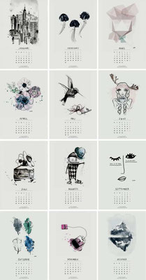
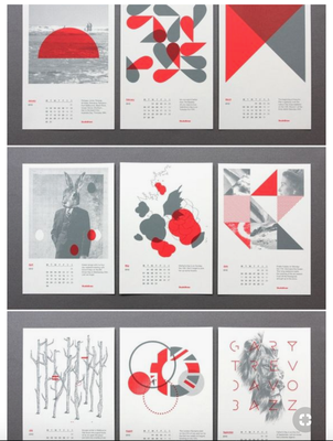
Calendar Month Design:
There are 12 months in a year (if you did not know this already).
You are to pick 2 months from a hat at random, these will be the months that you must create a design for.
You can use images/photographs in your design, however, you MUST include graphic design elements in your creation.
Think about the colors and themes that may be associated with the months you choose.
I will be looking to actually have these printed out so your designs need to be clean and something you will be proud to share with the public.