 Burr and Burton Academy
GRAPHIC DESIGN
Burr and Burton Academy
GRAPHIC DESIGN
Intro To Illustrator
Adobe Illustrator is the industry standard for Graphic Designers.
You will be using this program for a majority of your work for the rest of the semester.
This program is huge and takes hours of practice to learn all of the ins and outs of the program.
First thing first is to know how to set up you new document and the different components of Illustrator
Watch this video of how to set up a document. and set one up yourself.
Do not discard this document. Instead, go to File>Export as PNG and make sure to save it into your desktop folder. You will be uploading this to your Portfolio.
INTRO TO BASIC TOOLS
Watch each of these tutorials and follow along and create your own versions in ONE Illustrator document. You can do all of them on one document.
Make sure to save your work.
Do not discard this document! Instead, go to File>Export as PNG and make sure to save it into your desktop folder. You will be uploading this to your Portfolio.
This should take no longer than 3 class periods.
ONLY PRACTICE TOOLS IN RED!
Line Tool (Pen Tool)
Type Variations: (from:Egan CHS)
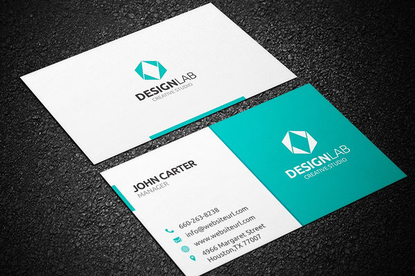
Business Card
In Unit 3 You were asked to draw in your sketchbooks a business card that represented you.
Now that you have played around with the tools above you are to take the things you have learned and create the business card from Unit 3.
Open a new Illustrator Document 4in x 6in.
This will be the Artboard for your card design.
Think about how you can use the tools to create the design you have thought up.
Once you have finished the design see Mr. Vincent.
If complete, Export your work and post it to your website with the sketch from Unit 3.


Collaboration Project
Flag Design
Using the elements and principles concepts and ideas that you have been working on for the past two weeks, you are to design an original Flag.
You will be partnered up to conceptualize, plan, ideate and execute a new flag design.
Think of the D.R.I.V.E. process.
Take a few minutes to talk with each other about possible similar things you have in common.
The flag could be one for your home town, school, state, country, family, organization, tribe, team, etc.
Take a look at this PDF
The Flag size should be 9in x 6in
Once you have talked through your concept or come up with an idea as to what the flag will represent begin sketching your ideas in your sketchbooks.
Think of shapes, colors and symbols that could be used.
Once you think your ideas are solid have a conversation with Mr. Vincent on how to move forward.
Things to remember:
- Keep It Simple (The flag should be so simple that a child can draw it from memory)
- Use Meaningful Symbolism (The flag’s images, colors, or patterns should relate to what it symbolizes)
- Use 2 to 3 Basic Colors (Limit the number of colors on the flag to three, which contrast well and come from the standard color set)
- No Lettering or Seals (Never use writing of any kind or an organization’s seal)
- Be Distinctive or Be Related (Avoid duplicating other flags, but use similarities to show connections
When you have completed the flag design export as a PNG to your portfolio also include images of all your sketches and any ideas that were written down in the process.
Submit it to OnCampus.
Exploring Type
The first "real" assignments you will be working on in Illustrator will be revolving around TYPE and WORD ART.
Illustrator only has so many fonts to choose from. There are many font sites that you can gather interesting fonts from to use in your designs. Take a look at the tutorial on how to download fonts.
Font sites: (there are many more sites to explore)
A great site to learn about Type and Typography.
Project 1 Part A
SAVE YOUR SAMPLES TO POST ON YOUR PORTFOLIO!
File > Export As > PNG
Watch both of the videos then use the techniques from them to do the Project.
For the best understanding of the tools follow along creating your own version using Illustrator for each Tutorial and Project.
You can do both on one art board.
Tutorial #1
Outlining Type
create outlines & direct select (from: Eagan CHS)
Tutorial #2
outlined type with pathfinder (from: Eagan CHS)

Project - 1 Part B
Demonstrate proficiency with converting type to outlines.
Use only type.
Create a type (text) design using your name and a short phrase.
Clearly demonstrate use of pathfinders and tweaking letters.
Use different fonts, colors, gradients and strokes
Use the direct select tool to tweak letters.
Try using a hard shadow.
Remember that you know how to rotate, shear, reflect. You know how to alter strokes. You know how to use gradients. You know how to adjust text leading and letter spacing.
This is a 2 class period assignment for a reason. The expectation is that you are using the skills you've learned to demonstrate that you are proficient with all of what you have learned so far.
Project 2 Part A
Watch both of the videos then use the techniques from them to do the Project.
Tutorial #1
Advanced Outlining Type
compound paths (from: Eagan
CHS)
Tutorial #2
minus front (from: Eagan CHS)

Project - 2 Part B
Create at least 2 short phrase designs which demonstrate proficiency with altering "donut" letters as well as "biting" letters.
Download the file for this assignment.
(from: Eagan CHS)
Project 3 Part A
Tutorial #1
Comstock / Offset Path
How do you create a common outline around objects or text?
Create
(from: Eagan CHS)

Project - 3 Part B
Create a one phrase design showing proficiency in offset path. Use several text sizes and colors.
Here is a site with tons of common phrases:
Project -4
Create several "punched" illustrations using silhouettes. Turn in the most successful 2 illustrations.
The overview : tutorial
Use the Silhouette link below.
Here is a link to tons of silhouette images.
(from: Eagan CHS)
Project - 5
Personal Logo
READ ALL INSTRUCTIONS
Create a series of 3 personal logos. You can use your name for the logo.
Each logo will be presented in both black & white and CMYK color (2 or 3 colors).
Design logos for these 3 descriptors:
- simple, basic design
- complex, (but NOT too BUSY)
- aggressive, think of and use a personal characteristic that others would identify with you (ex: outgoing, musical, athletic, confident, shy, religious, helpful, etc.) Try out 2 separate colors schemes with this one.

Emphasize skills and techniques that we've studied and practiced so far.
Present neatly on a 8.5x11 portrait art board.
Indicate CMYK color recipes. Indicate the 3 descriptors listed above.
(from: Eagan CHS)
“It’s through
mistakes that you actually can grow. You have to get bad in order to get good.” - Paula Scher