This Page is for students who have already taken Design 1 or Intro to Graphic Design.
Project #1
Flashback:
Go back to your portfolio from the last time you were in this class.
Choose one project that you know you could do a better job on.
Redo that project.
This should be a quick project, not the final.
Something you can complete in a few class periods.
The idea is for this to be a refresher to the tools and process of design.
Save and post to you portfolio.
Project #2
Pictogram
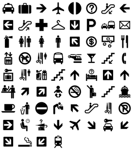
What are Pictograms?
Pictographs are often used in writing and graphic systems in which the characters are to a
considerable extent pictorial in appearance. A pictogram may also be used in subjects such as leisure, tourism and geography.
Pictograms have been used for centuries, think of
the Egyptians.
We have taken the concept of illustrating with images
and simplified them to the bare necessities.
You might even consider emojis.
Design Warm Up.
Fun With Pictograms.
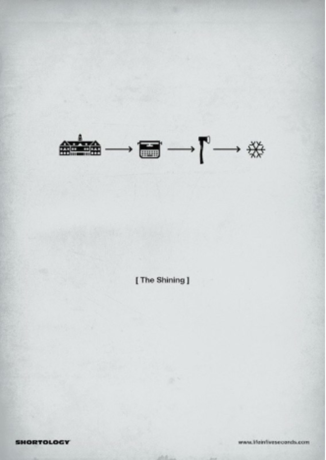
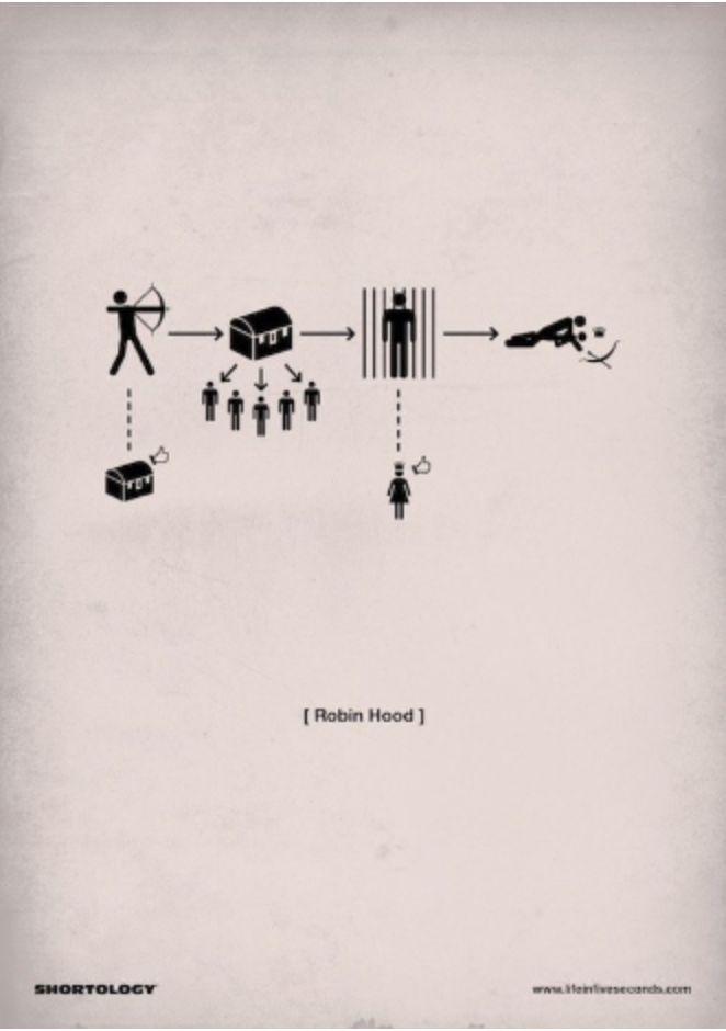
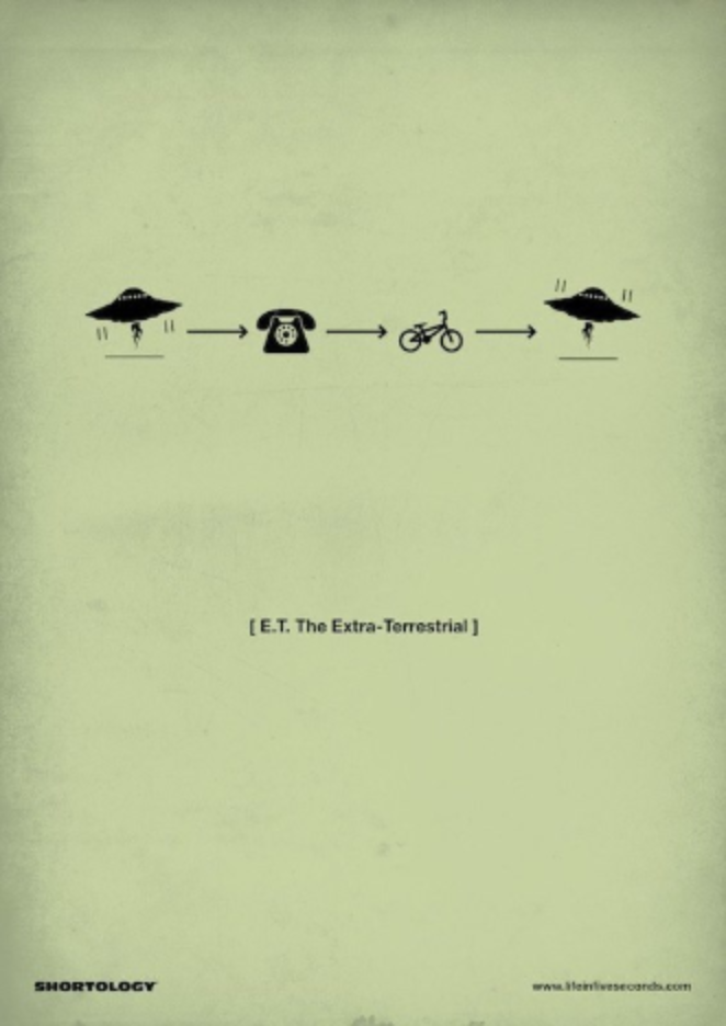
Pictogram "Shortology" Movie Poster. (Inspired by H-57 Design Group)
Create a movie poster that will describe the entire movie from beginning to end by only using Pictograms.
Using the Least amount of steps to be able to understand the premise of the movie.
Use your Sketchbook to try several variations of you ideas to make sure your "story" flows.
The movie poster should be 11x17 (tabloid).
The design should be contained in the top portion of the poster.
There must be a 1/4in space on all sides.
Pictograms must be in black.
Background color must be simple, no multi colored rainbow gradients.
The name of the movie should be in "20pt Helvetica Bold",
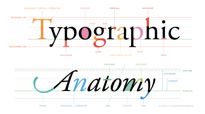
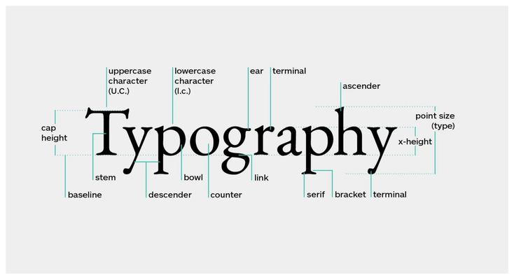
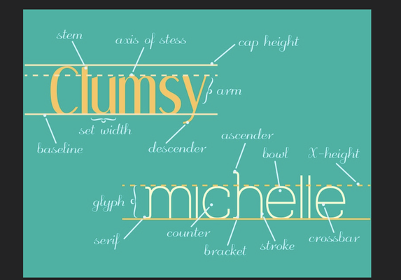
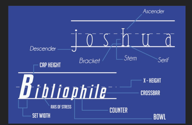
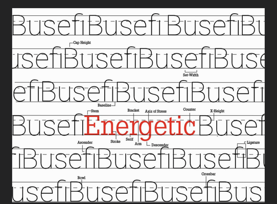
Typography is a HUGE aspect of graphic design. Just using those four capital letters changed the intensity of the sentence. How we use typography in our designs and the understanding how
typography and font choice matters in our designs could take up an entire semester of this class. The next two projects are based on the one element of design “Typography”.
Project #3
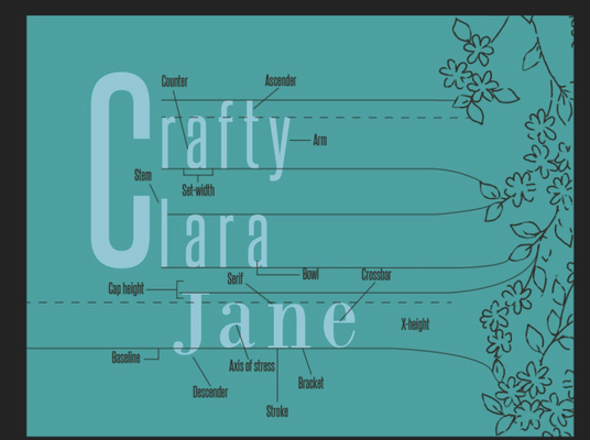
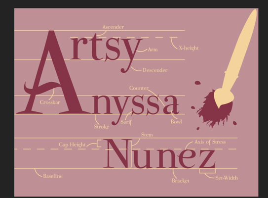
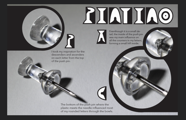
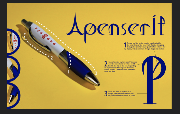
Name and Typography(inspired by; Beckman High School
Graphic design -G. Manning)
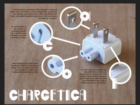
Find an object. Look around your house and find an object that looks interesting. Something that has structure, dimension and character. A day to day object that you use.
You are to study this object. Look at it closely, break it down into sections / parts / pieces / details. Look at the lines , curves, colors, imperfections. Photograph the object from all angles. Collect as much detail of the object as possible. This will be your inspiration. This is you research that you will be building
your iterations on.
With the details you have observed begin thinking of how you can create a new original font based on the details you have observed about the object you have chosen.
You will be using the other elements of design to help you with this process. Line, shape, form, space, color.
Sketch your ideas of lettering; (hand drawing fonts in graphic design is a powerful tool. If you can master this concept you can create incredible new concepts never before seen).
Once you have come up with sketches that are solid and make sense you will transfer your ideas to the computer using Illustrator.
This is to be all original work. You can not take a remade design off the internet or use a font that has already been created.
With your font, illustrate your creation with informational text that describes the ideas that you had and how you came up with your ideas. Explain how you took details of your subject and
incorporated them into your font design. Create a graphic that illustrates this information.
Graphic size: 8.5 x 11
Look at these examples for inspiration:
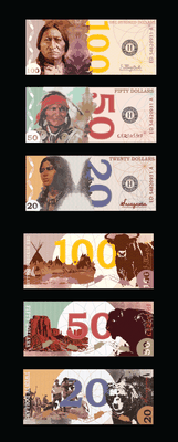
Project #5
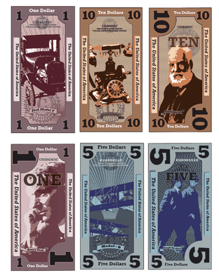
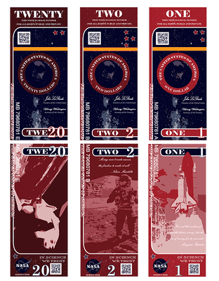
Currency
Re-design 3 U.S. currency notes (front and back, 6 total layouts). Use a subject/theme that’s different from the current focus on past presidents. The subject can be nature, a social issue, a
historical event or anything you think would be appropriate for the format. Your ‘target audience’ is the entire
country so your design should be nationally recognizable.
Bill Size/dimensions:
7.5wide x 3.25high (inches)
Your design can be horizontal or vertical
LEARNING OBJECTIVES
Research and develop an alternative themed identity solution for an existing design.
Use Illustrator or Vectornator as primary design tools to practice re-working existing forms into powerful visual messages.
Create consistency across multiple pieces of visual collateral.
Apply the Elements and Principles of design.
Rationalize design choices as they relate to the client and target audience.
Exercise professional practices.
DELIVERABLES
Students will submit:
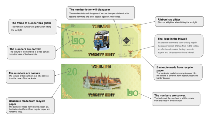
Six color or black and white prints (3 bill faces and 3 bill backs)
One color or black and white printed bill decoder sheet designating the features of the currency design and their uses. (Check this LINK)
One resource pack containing all R&D requirements: (word list, sources with notes, image inspirations all original or scanned/printed thumbnail and rough sketches).
One 2-page min. rationale describing the design solution. Include details on the currency, the client, audience and your experience and reflections designing this project. Use the Principles
and Elements of Design vocabulary we have been learning in class.
Original Digital files used for the final currency and bill decoder designs.
The goal here was to provide students with a capstone project for the course which integrated all of the tool skills, principles and elements of design as well as the design process from concept
to delivery. This project also serves as an introductory assignment to the next level course in the curriculum. I find this project works well engaging and challenging students on a variety of
levels. The one challenge we've experienced is in students clinging too closely to existing imagery and styles and not exploring more conceptual and creative possibilities. These students are
still in the minority as most of the project results are considerable departures from existing forms.
EXCELLENT OPPORTUNITY /
EXTRA CREDIT
Print and Graphics Scholarship Foundation (PGSF)
2021 Student T-Shirt Design Contest
Students: This is your opportunity to show your design skills. Educators: Please
consider scheduling this competition as part of your class assignments or projects for 2021.
The Print and Graphics Scholarship Foundation (PGSF) is proud to announce annual Promotional T-shirt Design Competition. The t-shirt will be used to promote the careers possible in graphics,
availability of scholarships through PGSF, and/or how graphic communications fit into today’s world. The winning entrant will receive a $500 check, an award certificate, and will be honored in a
national news release, on the PGSF website, and on social media platforms.
Design entries must include the following:
Prominently display Print and Graphics Scholarship
Foundation name and logo in the right or left hand corner
Design Theme Options (Pick one and showcase):
Graphic Communications in Today’s World
Career Opportunities in Graphics & Print
Apply for Scholarships in Graphic Communications
Bright and highly visible colors are great!
Final artwork:
Files should be high res jpg, png, tif or psd
(front side only)
Maximum / optimal area to fill for printing on
t-shirt is 13×18” max
Rules and Submission Instructions:
Submit entries as a pdf HERE!
Files should be named as follows:
Firstname_Lastname_Schoolname_2021
Include entrant’s school name and name of creative designer or
names of team members.
The winner of the contest must submit all files required for
reproduction. File become property of PGSF.
T-shirts will be produced and printed on the show floor at
Printing United.
Entries are due by April 10, 2021. Judging will be in May and the winner will be notified by May 31.
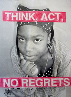
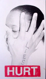
The Power of Advertising project uses technology in a matter-of-fact way to encourage you to explore how the underlying
assumptions in the social, cultural, and political aspects of their lives. It combines "high tech" black-and-white digital photography (with an inexpensive digital camera, computer, and printer)
with color created by hand with colored pencils or tempera paint. As artist Juan Chávez says, "I want students to utilize and play with technology, not worship it like a false idol."
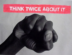
OBJECTIVES: Investigate themes by creating multiple text/image versions based on one issue or idea.
QUESTION TRUTH
THINK ABOUT Name one thing a person told you that you know was a lie. Can men do more than women can? Are women smarter than men
are? Do you believe everything you see on television or in textbooks? Why not?
CHOOSE AN ISSUE
Name an issue or message YOU feel needs to be "PROMOTED" within their community (or possibly
globally).
WRITE A SLOGAN
Create a slogan like "Just do it" or "Crack is Whack". It is best to have the saying be no more than 4 or 5 words. This is
really the most difficult part of this project. Most students will simply write down a statement of the issue and be satisfied with it as the slogan. You will reduce it to the least amount of
words possible without losing its meaning. Rewrite it as necessary and exchange certain words with slang words you use everyday. Take your time on this. This is the intense portion of the
project. Make your words meaningful.
Find PICTURES, create illustrations, but keep it simple. 1 photo, or 1 simple direct illustration.
I would love for you to try to create your own image or images before you search for images online. You can use a class camera to create any image you can
think of.
This process of image creation could also be done using traditional photography, found images, copying machine, or
stencils if you choose. Be creative.
I will accept nothing less than the best you can do.
SIMPLE AND DIRECT!
This is the first section of a TWO part
project.
You can think of this as either a cover to a magazine or, the
main image that will be included in a two page magazine layout.
Your set of Icons can be of anything however, You need to create all eight icons from scratch. This is NOT a image trace project!
The icons MUST revolve around a theme and they MUST be designed in the same way.
They can be as simple as you think they need to be or complex in details as well.
Project #9
Design and Illustrate a paragraph
You have 3 classes to complete this project.
Steps and Requirements 1. Choose 1 of the the following paragraphs to create your graphic representation of that moment. 2. Choose the medium or mediums you would like to use to create this illustration. You can use multiple mediums to create your final
image
• Photoshop and or illustrator • Cut paper • Charcoal and pastel • Montage of images • Crayons • Markers
3. Include your paragraph in the illustration: Note in the examples below, the paragraph became part of the design.
You must type your paragraph, Handwritten words are not
acceptable 4. Size is 11" x 17" or 17" x 11" 5. 4 Detailed sketches showing placement and size of image are required. Sketches must be in your sketchbooks and not on loose
paper.
Example: Moby Dick bodily burst into view! For not by any calm and indolent spoutings; not by the peaceable gush of that mystic fountain in his
head, did the White Whale now reveal his vicinity; but by the far more wondrous phenomenon of breaching. Rising with his utmost velocity from the furthest depths, the Sperm Whale thus booms his
entire bulk into the pure element of air, and piling up a mountain of dazzling foam, shows his place to the distance of seven miles and more. In those moments, the torn, enraged waves he shakes
off, seem his mane; in some cases, this breaching is his act of defiance.'
Choose from the following Books and opening Paragraphs
THE METAMORPHOSIS (FRANS KAFKA)
As Gregor Samsa awoke one morning from uneasy dreams he found himself transformed in his bed into a gigantic insect. He was lying on his hard, as it were armor-plated, back and when he lifted his
head a little he could see his dome-like brown belly divided into stiff arched segments on top of which the bed quilt could hardly keep in position and was about to slide off completely. His
numerous legs, which were pitifully thin compared to the rest of his bulk, waved helplessly before his eyes.
THE HITCHHIKERS GUIDE TO THE GALAXY (DOUGLAS ADAMS )
"Far out in the uncharted backwaters of the unfashionable end of the Western Spiral arm of the Galaxy lies a small unregarded yellow sun. Orbiting this at a distance of roughly ninety-eight
million miles is an utterly insignificant little blue-green planet whose ape-descended life forms are so amazingly primitive that they still think digital watches are a pretty neat idea."
PRIDE & PREJUDICE (JANE AUSTEN)
It is a truth universally acknowledged, that a single man in possession of a good fortune must be in want of a wife. However little known the feelings or views of such a man may be on his first
entering a neighborhood, this truth is so well fixed in the minds of the surrounding families, that he is considered as the rightful property of some one or other of their daughters.
THE HOBBITT (J.R.R TOLKIN)
In a hole in the ground there lived a hobbit. Not a nasty, dirty, wet hole, filled with the ends of worms and an oozy smell, nor yet a dry, bare, sandy hole with nothing in it to sit down on
or to eat: it was a hobbit-hole, and that means comfort.
A TALE OF TWO CITIES (CHARLES DICKENS)
It was the best of times, it was the worst of times, it was the age of wisdom, it was the age of foolishness, it was the epoch of belief, it was the epoch of incredulity, it was the season of
Light, it was the season of Darkness, it was the spring of hope, it was the winter of despair, we had everything before us, we had nothing before us, we were all going direct to Heaven, we were
all going direct the other way — in short, the period was so far like the present period, that some of its noisiest authorities insisted on its being received, for good or for evil, in the
superlative degree of comparison only.
PETER PAN (J.M. BARRIE)
All children, except one, grow up. They soon know that they will grow up, and the way Wendy knew was this. One day when she was two years old she was playing in a garden, and she plucked another
flower and ran with it to her mother. I suppose she must have looked rather delightful, for Mrs Darling put her hand to her heart and cried, 'Oh, why can't you remain like this for ever!' This
was all that passed between them on the subject, but henceforth Wendy knew that she must grow up. You always know after you are two. Two is the beginning of the end.
THE STRANGER (ALBERT CAMUS)
Mother died today. Or maybe yesterday, I don’t know. I had a telegram from the home: ‘Mother passed away. Funeral tomorrow. Yours sincerely.’ That doesn’t mean anything. It may have been
yesterday.
Project #5
2 class graphic design project.
You have been hired as the lead designer for the creation and layout of an advertisement.
The Job: Ampersand and Prang Design is looking for a designer to create an advertisement for their client Simpson’s and their 3inch individual stringettes. (SIMPSON'S INDIVIDUAL
EMPEROR STRINGETTES)
The ad size must be 8.5x11in portrait orientation, use no more than 3 fonts, (you must not use apple chancery, monotype corseva, or similar) and contain at least one photograph.
Think about the layout of your ad, colors used and who you are trying to get to buy these. Be specific in your reason for using what you are using.
Keep it clean but functional for the product.
Take a listen to this sound clip for some information and inspiration for your design.
Here is a link to the actual text from the sound clip.
This is to be fun and creative (Yet clean and professional looking) so have at it and see what you can come up with.
Post all your sketches and iterations plus final design on your portfolio.
Project # 6
Social Issue Poster
You must decide upon an issue you have a strong opinion on, or a viewpoint you want to express. You must express this viewpoint using multiple layers of text, graphics,
effects, photos and blending tools to design a digital artwork in a propaganda-style (Look this up). You may search the internet, take photos, scan artwork or create original material for
images.
Social issues are controversial political issues which relate to people's personal or professional lives and interactions. Social issues are distinguished from economic
issues. Some issues have both social and economic aspects, such as immigration. There are also controversial issues that don't fall into either category, such as those associated with wars
and religion. Or things like climate change or vaping.
1. Further exploration of Adobe photoshop and Adobe InDesign
2. Understanding the principals of color, design and composition
3. Creative use of Typography
4. Students will use layers in photoshop, and use Opacity layers, layer masks, and filters
Requirements:
Digital Photography for imagery. You are required to take photos for the images in your poster
11 x 17 document
CMYK color
300 dpi
Photoshop filters requirements
Final file to be saved as a Print ready PDF
PROJECT #11
2032 Summer Olympics
PROJECT BRIEF
OVERVIEW:
The summer Olympics exemplifies the pinnacle of human athleticism, while bringing together athletes from 206 nations to a selected country. Every four-years, a selected country is host to
over eleven-thousand competitors as they compete in 339 events in just over two-weeks. During this time, the host country's culture, creativity, technological achievements, and
geographical beauty are on display to the world through festivities, mascots, various promotional materials, and branding.
STUDENTS PROMPT:
For this project, students are tasked with designing the brand elements for a 2032 Summer Olympic host city that's selected at random.
The branding elements include the Olympics: logo, icons for eight assigned sports, signage, and layouts for tickets, deck pass, and apparel.
Can't decide on a country, Take a chance with a spin of the
Maybe even push it to the very end by eliminating countries to the final one standing.
LEARNING OBJECTIVES
Students will thoroughly research their assigned country's culture, geography, iconography, and historical achievements that will aid in designing the brand language for their 2032 Summer
Olympics. The research and style guide students develop will be stretched across various forms of medium and applications. Throughout the process, students will learn:
+ Different methods of research and how to apply it to design.
+ Logo design and how a mark responds to various medium, and how its approach can transfer to iconography.
+ Color theory and application
+ Brand Style Guides and how to present work to clients.
DELIVERABLES
+ Students will create a 10 x 10 matrix that includes identifiers of the host country along one axis, and identifiers of the summer olympics along the other axis.
+ Create in your portfolio, a layout that includes sections for the project's: Overview, Process, Logo and its grid structure, Color and Fonts, Sport icons, signage, and three mockups for
the sport tickets, deck pass, and apparel.
REFLECTIONS
I initially assigned this as the final cumulative project in our Studio Level Graphic Design course, but have since found that it can be taught in any course that integrates
iconography, symbology, and branding. With that said, however, outcomes are best when students have a strong understanding of iconography, how design principles can be applied to
iconography, branding and presentation.
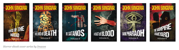
PROJECT #7
Book Jacket Design Series:
Find a popular book series and design a cover for each book.
Make the covers connect in some way.
No more than 4 books (don't attempt to design new covers for a set of encyclopedias!)
One cover per book, you do not need to create the inside flaps of the book Just the cover spine and back cover.
Once the design is complete place your designs onto the Book Series Mockup.
Take some time to look through this list, maybe even try to listen to a few of them (within reason, this does not give you permission to become distracted from the work in class) and pick one you
will base your project on.
Take things to the next level and design a logo for your band.
See Mr. Vincent for Design Brief Packet.
Mockup Links
PROJECT #10
PROJECT #10
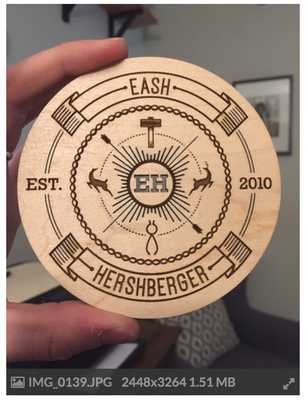
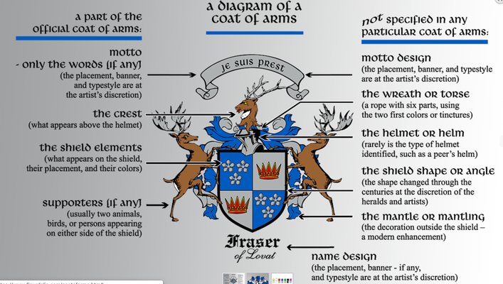
FAMILY COAT OF ARMS /CREST
READ ALL INSTRUCTIONS BEFORE BEGINNING THIS PROJECT!
Create a Family Crest Using Adobe Illustrator.
This will require some research of your family history / heritage.
Do the best you can with this. Genealogy can take you into many different directions and can lead you back for many generations. I am not looking for you to do a full genealogical breakdown of
your family history.
Where do they come from?
Ask family members if you don't know about your family history.
Maybe there is already a family crest on record. If there is I would like this to be a redesign not a copy of the original. However, you can most definitely take parts from the original to
use in your new design.
Don’t: Copy someone else’s coat of arms or family crest.
To usurp the use of another person’s coat of arms is highly improper and is a dishonest practice. It isn’t, technically speaking, against the law to do it, but you should still avoid it.
Do: Take the time to learn the meaning behind the symbols.
The animals, plants, people, and designs that appear on a coat of arms (and also in a family crest) have specific meanings. Each color you see in a coat of arms also conveys something specific.
Take the time to find out what something means before you put it into your artwork.
Don’t: Base your design around your surname.
There are many people in this world whom you share a surname with. Obviously, this does not mean you are related to all of them. Genealogists with the last name of “Smith” or “Jones” quickly
discover that truth. How much meaning would a coat of arms based on your surname really have?
Instead, you can do something different. Choose an ancestor and make a family crest for him. Include elements in the design that have a meaning that relates to his accomplishments, occupation,
and life. Another option is to make one for yourself.
Every Coat of Arms has its own unique traits. You do not have to follow the traditional style if you don't want to.
But there are a few things to think about when gathering your information and how they have traditionally been placed or arranged in a family crest.
When designing your crest you will need to keep in mind that there will be two versions of your design.
- One will be in black and white. This design will be transferred to wood or another material using the "Glowforge" Laser cutter. (see the wood example above).
- The second will be in color. This will be printed on the Inkjet Printer.
Take a look at a couple of these links for information on Heraldry and Family names.
Do more research than these sites, this is only a tiny amount of information.
When designing, get as much information into your sketchbooks (this is part of your grade).
Once you are working in Illustrator be sure to take advantage of the "Layers" and separate the design into sections.
There will most likely be many parts and pieces to your design. try to have them on separate layers or groups on separate layers.
The Illustrator version should be created in lines first. Black and White
Once you have completed the first line version in Illustrator you will have two options.
1. Keep it in Illustrator and add color your Illustrator file.
2. Save and transfer the design to Photoshop and add color, shading and dimension. See Link (LINK)
PROJECT #10
Animated GIFF
gif by: Beth Bardin 2018
gif by: Ricky Xue
Let’s say you have a folder full of images that you want to sequence together as frames in an animated GIF. You can find special programs online to do this, but with some of the new features of
Adobe Photoshop, it’s quite fast and simple.
You will created a 20 second animated feature:
Using a minimum of 20 images, you will create a 20 second animated GIF. If you decide to create a more detailed cartoon like animated GIF, be aware that the standard high quality cartoon is done
at 24 frames per second. So you will need a minimum of 100 images for a decent quality animation.
I will give a full extra credit grade for those of you who choose to take on this challenge.
Step 1: Research your subject matter, make it funny
Step 2: Find or create 20 images that are consecutive. Use your phone to take photos of images and adjust there sizes in photoshop.
PROCESS
Gather the images you want to animate into one folder. collect 20 images, or create 20 images, for an animated feature.
Click File > Scripts > Load Files into Stack. When the “Load Layers” window pops up, click Browse to select & open your image files, and then click OK. This should
import the files you selected as individual layers in your document. Rearrange the layers into the correct order, if necessary.
Timeline palette. So, go to (Window > Timeline)
In the Animation/Timeline palette menu (found under this button at the top right corner of the palette: ), click CREATE VIDEO TIMELINE
Now we will change the duration of each frame. Make sure you are in frame view, not timeline view. If you do not see thumbnail icons of all your layers in the Animation/Timeline palette, click
the icon in the lower right corner (the hover text will say “Convert to Frame Animation”)
Once the frame order and timing has been set up, it is time to save the image!
Use the effects button and or motion button as necessary to create visual effects.
Requirements:
At least 20 images
Size is 9" x 4"
RGB
72 dpi.
Each will go on a separate layer.
Retouch each photo as necessary, for consistency from slide to slide. For Example All background should be the same
All photos should have the same brightness and contrast.
EXTRA CREDIT: IF you finish early on your first animated GIF, or if you would like the extra credit, design a GIF of your choice.
At least 10 images
size- 4 x 4
RGB
72dpi
Each will go on a separate layer.
Retouch each photo as necessary, for consistency from slide to slide. For Example All background should be the same.
All photos should have the same brightness and contrast.
Use your personal photos.
Humor is essential.
PROJECT #11
Project #8
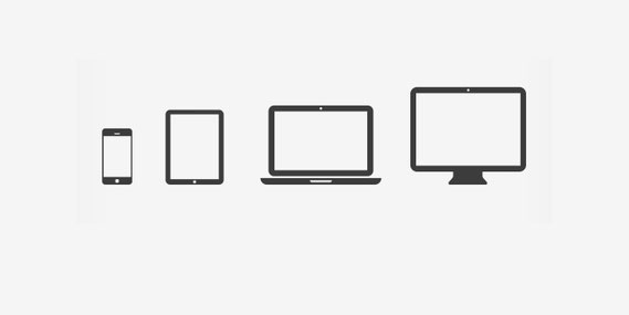
Responsive Icon Design
We live in a world now that has multiple screen size devices that we use to get our information from. Each screen has different properties and the way that
information is displayed changes per screen size.
Your assignment is to create a series of icons that will represent a specific "Icon" over 4 different screen sizes.
These are called "Responsive Icons".
Responsive icons do not mean that the width of the screen determines how big an icon is displayed; actually it means that a different icon is displayed
based on the size it is presented in. This means that screen size does not matter but the size of the icons itself does. This is because some icons will be displayed in various sizes – at the
same time, on the same screen.
The difference between icons won’t be anything more but the quality of detail displayed. We are talking about having a lot of detail in an icon which is displayed big at say 500px by 500px, a
little less detail for an icon which is displayed 250px by 250px and as little detail as possible for an icon that is only 25px by 25px in size. I’m sure you can image that a single icon would
look boring and even render poorly if you have very extensive icon and displaying it very small.
As it is stated above, you will be creating 4 icons that are all connected to the same theme or original icon.
The measurements are as follows:
500px by 500px
250px by 250px
100px by 100px
25px by 25
Each icon must be relatable to the other 3.
The largest icon will have the most detail and the subsequent icons will lose detail as they get smaller.
The icon you use is up to you. You can use an already existing Logo but think about how you might have to change it to accomplish this task. Use your Sketchbook to test your ideas before you jump
to the computer.
Show Mr. Vincent your ideas before you get onto the computer.
Project #9
Project #10
Final Project 1
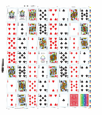
Deck of Cards
Hierarchy and priority grouping are the main design focus of this assignment. Above all else, make the hierarchy clear and ordered through your visual system. Within the context of the entire
deck of card there is an implied priority order. Within each separate suit, there is a priority grouping as well. Certain cards appear to be worth more than others regardless of the game played
with them. This relative importance should be evident by the look of the cards themselves, it should not require an explanation to make this relationship understood.
Thematic unity is a secondary focus of this assignment. Base your set of cards around a theme which can be extended through various levels of implied importance and similarity grouping. Look for
similarities as well as differences among characters/roles, objects or events to to draw inspiration from. Are there any "good guys" and "bad guys?"
In the West, a standard deck of cards is made up of 52 individual cards divided up into 4 suits: Spades, Hearts,
Diamonds and Clubs. Each suit has 11 cards, the face cards: Ace, King, Queen, Jack and the number cards: 10, 9, 8, 7, 6, 5, 4, 3 and 2. Two Jokers can also be found and are used in some card
games. However, there are some common features that all decks world wide have in common: having a the same pattern on the back of each card in a deck, having suits which set up a hierarchy order;
object are used to depict each suit- Spades, Heats, Diamonds, Clubs, Acorns, Rods, Coins, Swords etc. Equally varied in depiction are the subjects for the face cards. Some of the figures have
come from history, others from characters in literature and still others from the imagination of the person who has designed the deck.
This is a very large task. It will take planning and sketching before you begin working on the computer.
The number cards will be easier to organize than the face cards.
Do some research as to what the standard card deck looks like and what suits and face cards are in them.
You must create the 52 playing cards, One Joker and One front/back design.
You can take this in any direction you wish however, it is to be clean, organized and professional. That does not mean you cant be creative and fun!
Use the Card Template below as your guide.
Check out the link for ideas and do plenty of research and brain storming.
You MUST review your ideas with me before you begin working on the computer.
Review on progress will be at Mid Term Exams.
Incentive; if card deck is completed well there is a possibility to have them made into a real set of cards!
Create the design for a board game. Include the directions sheet, the board, playing pieces, cards (optional), and any other pieces necessary to play the game.
Objectives
•Select and use the best tools for the job
•Incorporate multiple elements into a sophisticated, unified design
•Visualize a digital artwork in three dimensions
Parameters
•Design all parts in their actual size
When complete:
•Save as PDF onto your E-Portfolio
•Print to be scored, folded, and constructed
Grading Criteria
•Design -- visual impact
•Inclusion of all important information
•Clarity, Playability
•Technical quality
•Work habits / productive use of class time.
Steps
1.Develop a theme/concept for the game
2.Write and design a sheet of directions to be placed in the game box. You may use Photoshop, Illustrator and/or InDesign to create this document.
Include:
•Game Title
•Ages
•Contents
•Set Up
•Objective
•Playing the Games (Steps, Rules, Directions)
3.Develop the board and game pieces. Be sure to consider the principles of good design to maximize the visual appeal of your game.
 Burr and Burton Academy
GRAPHIC DESIGN
Burr and Burton Academy
GRAPHIC DESIGN