Burr and Burton Academy
GRAPHIC DESIGN
Burr and Burton Academy
GRAPHIC DESIGN
Design Building Blocks
What is Graphic Design?
Graphic design is a creative process that combines art and technology to communicate ideas. The designer works with a variety of communication tools in order to convey a message from a client to a particular audience. The main tools are image and typography.
Instructor Presentation:
The Universal Arts of Graphic Design
Font Men (The world of typography)
Why Design.
Graphic designers work with drawn, painted, photographed, or computer-generated images (pictures), but they also design the letterforms that make up various typefaces found in movie credits and TV ads; in books, magazines, and menus; and even on computer screens. Designers create, choose, and organize these elements-typography, images, and the so-called “white space” around them-to communicate a message. Graphic design is a part of your daily life. From humble things like gum wrappers to huge things like billboards to the T-shirt you’re wearing, graphic design informs, persuades, organizes, stimulates, locates, identifies, attracts attention and provides pleasure.
Finally, being a designer is about understanding people (often very specific groups of them). You must intuitively or explicitly know a thing or two about human psychology. What motivates people to act? How will people respond to certain visual styles? How can you leverage design to help people understand whatever it is you want to tell them?
Bez Vector Illustrator
Adobe Illustrator Draw
Vectornator - Vector Art (So far my favorite)
Assembly: Graphic Design & Art
Quiz
Look over these two links:
Read through these 2 Links and take notes. You can use your sketchbooks or iPads or online portfolios to take your notes.
There will be a quiz based around the terms on these pages.
Links for information:
You can use these links as starting points for some of the information. There are hundreds more resources out there to look at so take the time to look around. Make sure your definitions pertain to the use in Graphic Design.
Elements and Principles: 3 class Periods
There are seven elements of graphic design that are the starting point of your design ideas. Each of these elements is a building block to a good layout.
You are probably familiar with most of these elements from everyday life so there is nothing mysterious about them. Each one of these elements can be used to design different layouts depending on how you use them.
When using the elements of design, it is important to know which elements are necessary and which are not. Knowing this will keep your layouts clutter-less and help strengthen your design.
Elements of Design:
Line
An element of art used to define shape, contours, and outlines; also to suggest mass and volume. It may be a continuous mark made on a surface with a pointed tool or implied by the edges of shapes and forms.
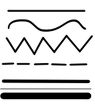
Characteristic of Line are:
Width - thick, thin, tapering, uneven
Length - long, short, continuous, broken
Direction- horizontal, vertical, diagonal, curving, perpendicular, oblique, parallel, radial, zigzag
Focus- sharp, blurry, fuzzy, choppy
Feeling- sharp, jagged, graceful, smooth
Types of Line:
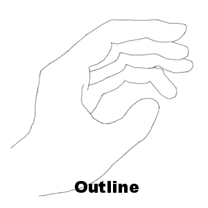
Outlines- Lines made by the edge of an object or its silhouette.
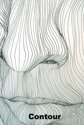
Contour Lines- Lines that describe the shape of an object and the interior detail.
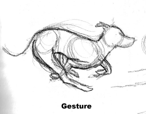
Gesture Lines- Lines that are energetic and catch the movement and gestures of an active figure.
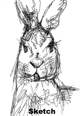
Sketch Lines- Lines that capture the appearance of an object or impression of a place.
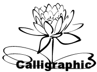
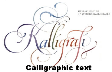
Calligraphic Lines- Greek word meaning "beautiful writing." Precise, elegant handwriting or lettering done by hand. Also artwork that has flowing lines like an elegant handwriting.
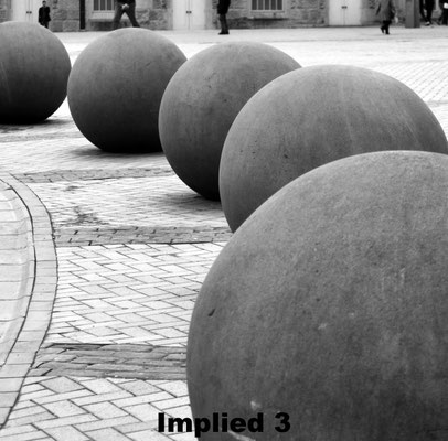
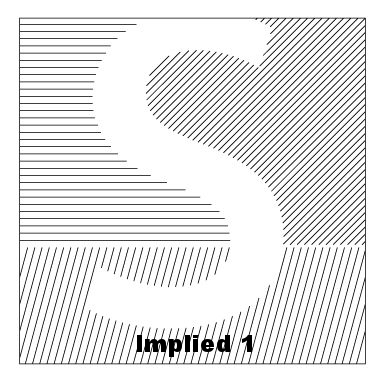
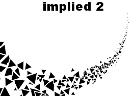
Implied Line- Lines not actually drawn but created by a group of objects seen from a distance. Implied line is the direction an object is pointing to, or the direction a person is looking at.
Project #1
Name the Line:
1. In your Sketchbook draw 6 boxes on one page.
In each of boxes show an example of each of the six types of line.
Use the characteristics from above.
2. Under the box write the name for the style of that line.
Color
Color comes from light - if it weren’t for light, we would have no color. Light rays move in a straight path from a light source. Within this light, rays include all of the colors in the spectrum or rainbow. Shining a light into a prism will create a rainbow of colors because it separates the color of the spectrum. When the light rays hit an object, our eyes respond to the rays that are reflected back and we see only the reflected color(s). For example, a red ball reflects all the red light rays. As artists, we use pigments in the form of powder or liquid paints to create color.
Categories of Color
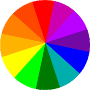
A Color Wheel is a tool used to organize color. It is made up of:
Primary Colors - Red, Yellow, and Blue. These colors cannot be mixed, they must be bought in some form.
Secondary Colors - Orange, Violet, and Green. These colors are created by mixing two primary colors.
Intermediate Colors - Red Orange, Yellow Green, Blue Violet, etc.; mixing a primary with a secondary creates these colors.
Complementary Colors - Colors that are opposite each other on the color wheel. When placed next to each other they look bright and when mixed together they neutralize each other.
Color Harmonies
Color Harmonies are certain combinations of colors that create positive looks or feelings.
Analogous Colors are colors that are next to each other on the color wheel. Examples include red, red orange, and orange.
Triadic Harmonies are three equally spaced colors on the color wheel. For example, yellow, Red, and Blue are a triadic harmony color scheme.
Monochromatic is one color used with different values and intensity. For example, light brown, brown and dark brown are monochromatic colors.
Warm colors are on one section of the color wheel and give the felling of warmth. For example, red, orange, and yellow are the colors of fire and look warm.
Cool colors are on the other side of the color wheel from the warm colors. They give the feeling of coolness. For example, blue and violet are the colors of water, and green is the color of cool grass.
Project #2
Color Theory: 2 Class Periods
Knowing how color works in Design is an integral element to how people relate to your designs. Knowing the relationship between colors will help you to create stronger designs for specific clients.
You are to create a 12 spoke color wheel containing Primary, Secondary and Tertiary colors using pens, pencils pastels or any other materials you can find. This is not a long term craft project. The idea is to make it clean, legible and quickly. Do not scrutinize over precision.
You will be provided a 8.5 x 11" piece of paper for you to create your wheel on.
I will also provide colored pencils, markers, scissors, rulers and glue.
Because this can become a messy process, always clean your area at the end of class.
You are encouraged to take these home and work on them if you feel you will need more time.
Take a look at this link at: ColorMatters.com
Once you have completed your Color Wheel use your iPad to Photograph it and post onto your portfolio.
On your Portfolio describe your process and list the;
- Primary Colors
- Secondary Colors
- Tertiary Colors
Give a brief description as to why color is so important to Graphic Design.
Class Discussion and Share Out.
Shape
Shape: When a line crosses itself or intersects with other lines to enclose a space, it creates a shape. Shape is two-dimensional and has height and width, but no depth.
Categories of Shapes:
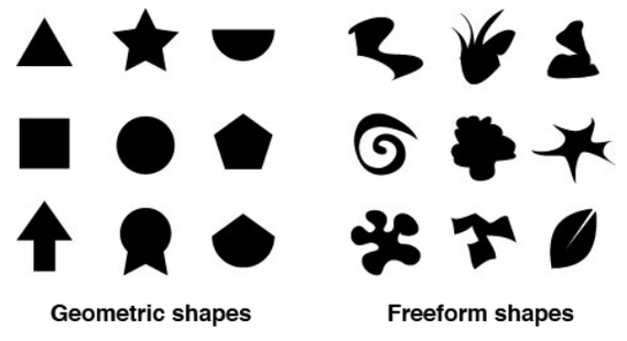
Geometric Shapes - Circles, Squares, rectangles, and triangles. We see them in architecture and manufactured items.
Organic Shapes - Leaves, seashells, and flowers are organic shapes. We see them in nature and they have free flowing, informal and irregular characteristics.
Positive Shapes - In a drawing or painting, positive shapes are the solid forms (positive space) in a design such as a bowl of fruit. In a sculpture, positive shapes are solid areas of the sculpture that remain after removing portions of the sculpture.
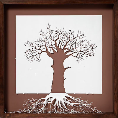
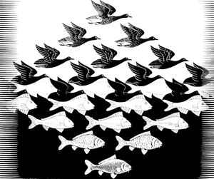
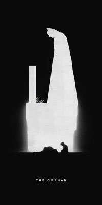
Negative Shapes - In a drawing or painting, the space around the positive shape is negative space. Negative space can form a shape when it meets a positive shape. Negative space can include the sky or spaces between objects. In sculpture, the negative space is the portion that is removed from a sculpture. The negative space can become a shape when it meets the positive form of the sculpture.
Static Shapes - Shapes that appear stable and resting.
Dynamic Shapes - Shapes that appear to be moving and active.

Project #3
Create a design:
On one page of your portfolio draw 4 boxes, number them 1, 2, 3, 4
- In box 1 create a design with Geometrical Shapes (see above)
- In box 2 create a design with Organic / Freeform Shapes
In the second two boxes below,
In Boxes 3 & 4 draw the same picture in each box.
- In the first box, shade the positive space
- In the second box, shade the negative space.
Photograph and put on your portfolio.
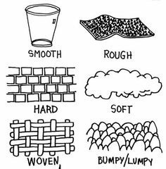
Texture
Texture is the surface quality of an object. A rock may be rough and jagged. A piece of silk may be soft and smooth, and your desk may feel hard and smooth. Texture also refers to the illusion of roughness or smoothness in a picture.
Categories of Texture
Real Texture is the actual texture of an object. Artists may create real textures in art to give it visual interest or evoke a feeling. Real texture occurs only in a three-dimensional sculpture or a collage. A piece of pottery may have a rough texture so that it will look like it came from nature or a smooth texture to make it look burnished.
Implied Texture in two-dimensional art is made to look like a certain texture but in fact is just a smooth piece of paper. Like a drawing of a tree trunk may look rough but in fact it is just a smooth piece of paper.

Project #4
Create 4 boxes in your sketchbook.
- In each box create a different type of texture in the box.
- Explain what the texture is at the bottom of each box.
Photograph and put on your portfolio.
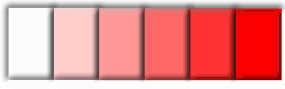
Value
Value is the range of lightness and darkness within a picture. Value is created by a light source that shines on an object creating highlights and shadows. It also illuminates the local or actual color of the subject. Value creates depth within a picture making an object look three-dimensional with highlights and cast shadows, or in a landscape where it gets lighter in value as it recedes to the background giving the illusion of depth.
Categories of Values
Tint is adding white to a color paint to create lighter values such as light blue or pink.
Shade is adding black to a paint color to create dark values such as dark blue or dark red.
High-Key is a picture with all light values.
Low-Key is a picture with all dark values.
Value Contrast is light values placed next to dark values to create contrast or strong differences.
Value Scale is a scale that shows the gradual change in value from its lightest value, (white) to its darkest value (black).
Project #5
Create a 5 value, Value Scale.
In your sketchbook draw a long rectangle, break that into 5 sections.
- On the right, leave it blank. That box will be the lightest value of the value scale.
- The box on the far left will be the darkest value, so shade it in completely black (or the color that you choose).
- The three remaining boxes are then shaded in to show a gradual change from the lightest to the darkest values.
Photograph and put on your portfolio.
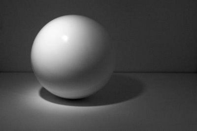

Form
Form is the three-dimensionality of an object. Shape is only two-dimensional; form is three-dimensional. You can hold a form, walk around a form, and in some cases walk inside a form. Value can imply form in drawings or paintings. Shading a circle in a certain manner can give it the illusion of a sphere.
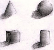
Project #6
Types of Form
Draw and shade correctly the four basic Forms.
- Square(cube),
- Circle(sphere),
- Triangle(pyramid),
- Rectangle(cylinder)
Photograph and put on your portfolio.
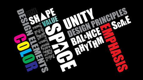
PRINCIPLES OF DESIGN
Principles of Design:
The Elements of Design are the language of art, while the Principles of Design are the fundamental facets of art composition. Knowing and appreciating the Principles of design are essential for the creation of successful visual expression. By utilizing the Elements and Principles, an artist can accurately portray the intended visual concept. It also gives one the ability to accurately discuss an artwork by identifying those structural elements that were used in the creation of the artwork.
Balance
Is a feeling of equality of weight, attention, or attraction of the various elements within the composition as a means of accomplishing unity.
Types of Balance:
To balance a composition is to distribute its parts in such a way that the viewer is satisfied that the piece is not about to pull itself over. When components are balanced left and right of a central axis they are balanced horizontally. When they are balanced above and below they are said to be balanced vertically. And when components are distributed around the center point, or spring out from a central line, this is referred to as radial balance.
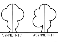
There are two forms of visual balance. These are symmetrical balance, also known as symmetry or formal balance, and asymmetrical balance, also known as asymmetry or informal balance.
-Symmetrical balance is when the weight is equally distributed on both sides of the central axis.
-Asymmetrical balance is when both sides of the central axis are not identical, yet appear to leave the same visual weight.

Project #7
In your sketchbook draw examples of the five types of balance.
- Horizontal,
- vertical,
- radial,
- symmetrical,
- asymmetrical
Photograph and put on your portfolio.
Contrast
Contrast in art and design occurs when two related elements are different. The greater the difference the greater the contrast.
Types of contrast
The most common ways of creating contrast are by creating differences in:
• Size
• Value
• Color
• Type
• Shape
• Texture
• Alignment
• Direction
• Movement


Project #8
In your sketchbook show 5 contrasting elements.
This can be done in pairs (eg. BIG vs small). You can use colors as well.
Photograph and put on your portfolio.
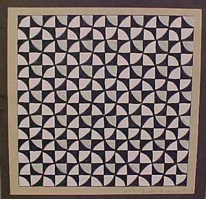
Repetition and Rhythm -
The act of repeating an element either regularly or irregularly resulting in a rhythm of the repeating elements. Always being aware about space and balance. The act of repeating an element either regularly or irregularly resulting in a rhythm of the repeating elements.
Project #9
In your sketchbook draw 3 samples of repetition and rhythm.
Photograph and put on your portfolio.
Space
Negative space surrounds a sculpture or object. A person can walk around sculptures and objects, look above them, and enter them. Space refers to the space inside, around, and above a sculpture or object. A three-dimensional object with positive space will have height, width, and depth.
Space in a two-dimensional drawing or painting refers to the arrangement of objects on the picture plane. The picture plane is the surface of your drawing paper or canvas. You can have a picture plane that is a crowded space with lots of objects or an empty space with very few objects. A two-dimensional piece of art has height and width but no depth. The illusion of depth can be achieved by using perspective. Perspective is the technique that is used to create the illusion of depth in your picture. Perspective makes your picture look like it is moving to the distance like in a landscape or cityscape.
Categories of Space
Positive Shapes - In a drawing or painting, positive shapes are the solid forms (positive space) in a design such as a bowl of fruit. In a sculpture, positive shapes are solid areas of the sculpture that remain after removing portions of the sculpture.
Negative Shapes - In a drawing or painting, the space around the positive shape is negative space. Negative space can form a shape when it meets a positive shape. Negative space can include the sky or spaces between objects. In sculpture, the negative space is the portion that is removed from a sculpture. The negative space can become a shape when it meets the positive form of the sculpture.
Static Shapes - Shapes that appear stable and resting.
Dynamic Shapes - Shapes that appear to be moving and active.
Create a Shape
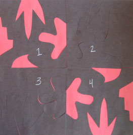
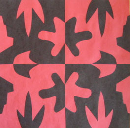
Project #10
In the style of Japanese Notan Art (Examples)
You will create a design using positive and negative space.
 1.
Start with two 9" squares of construction paper in contrasting colors. (Here
I’m using black and red.) Choose one color to be the background and set it aside.
1.
Start with two 9" squares of construction paper in contrasting colors. (Here
I’m using black and red.) Choose one color to be the background and set it aside.
2. Fold the other square in half vertically and then in half again horizontally.
3. Draw one large shape on each side of your folded square. Each shape should be different and none of them should touch or overlap. (Have teacher check before
you cut!) 4.
Cut out the shapes you drew and save all the pieces!
4.
Cut out the shapes you drew and save all the pieces!
5.
Now, open up your paper and lay it flat. Label the sections 1, 2, 3 and 4, from left to right, top to bottom.
6. Then, cut your four sections apart. Glue #1 and #4 in place (across from each other diagonally) on the contrasting paper. These sections are now finished!
7.
Next, lay sections #2 and #3 in place, but do not glue them down! Place the  cut-out
shapes where they go – no glue yet!
cut-out
shapes where they go – no glue yet!
8.
Carefully, lift off the main pieces and then glue the smaller shapes in place
on section #2 and #3. You’re done!
Project #11
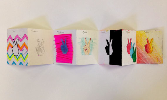
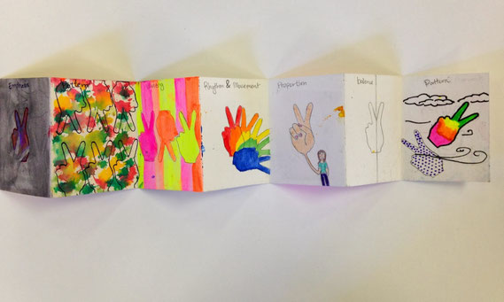
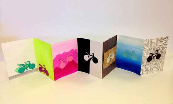
Elements and Principles Book Project
This project is to help you grasp the elements of art & principles of design that will guide your design making process for the rest of the year!
Each student chose one symbol, letter, or object and created a cut out stencil using card stock. Then created accordion fold books with watercolor paper, with each square being 2"x3". Using your stencil & different mediums you must illustrate the ELEMENTS of art on one side ( line, shape, color, value, form, texture, space) and then the PRINCIPLES of design ( pattern, Balance, space, unity, variety, proportion, emphasis) on the reverse.
See examples below: