 Burr and Burton Academy
GRAPHIC DESIGN
Burr and Burton Academy
GRAPHIC DESIGN
Graphic Design Theory
Elements of Graphic Design (tasty tuts)
What is Graphic Design?
Graphic design is a creative process that combines art and technology to communicate ideas. The designer works with a variety of communication tools in order to convey a message from a client to a particular audience. The main tools are image and typography.
Instructor Presentation:
The Universal Arts of Graphic Design
Font Men (The world of typography)
Why Design.
Graphic designers work with drawn, painted, photographed, or computer-generated images (pictures), but they also design the letterforms that make up various typefaces found in movie credits and TV ads; in books, magazines, and menus; and even on computer screens. Designers create, choose, and organize these elements-typography, images, and the so-called “white space” around them-to communicate a message. Graphic design is a part of your daily life. From humble things like gum wrappers to huge things like billboards to the T-shirt you’re wearing, graphic design informs, persuades, organizes, stimulates, locates, identifies, attracts attention and provides pleasure.
Finally, being a designer is about understanding people (often very specific groups of them). You must intuitively or explicitly know a thing or two about human psychology. What motivates people to act? How will people respond to certain visual styles? How can you leverage design to help people understand whatever it is you want to tell them?
Follow the instructions for each "Element".
Post all of your findings in a clean organized manner on your Portfolio.
All posts should be in Unit 2. Each with its own heading.
You should be able to complete at least two of these in a class period. This means you should complete this unit in four class periods.
If you run out of time during regular class time, use Flex or even time at home to complete the work.
For each Element, I want you to read the text, look at the examples and watch the short video for each.
Once you have done that, You will need to go out and find one "real life" example for each element and photograph it with your iPad.
You will then post the example on your portfolio with a written explanation as to how the specific Element is being implemented in the example you found.
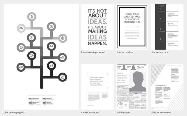
1) Line Visual Element
One of the most basic visual elements of design is the ‘line’, and it should not be underrated.
As simple as lines are they can be used as crucial elements of design.
Lines can be used to add structure to a composition, to frame information and to divide information. Lines can be used to add hierarchy and emphasis, to decorate and to draw the eye to a specific point.
They can also be used to build and represent information in info graphics.
Lines can be straight, curved, thick, thin, solid, and dashed.
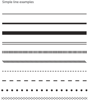
Design Examples using Line.
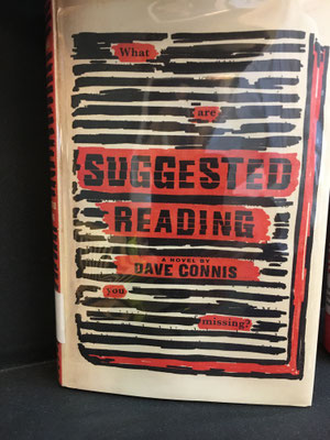
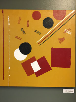
Good and Bad examples.
Left is good use of line in graphic design. The use of thick black lines to represent redacted text is good.
Right is not good. It is not graphic design, it is a painting including shapes and line.
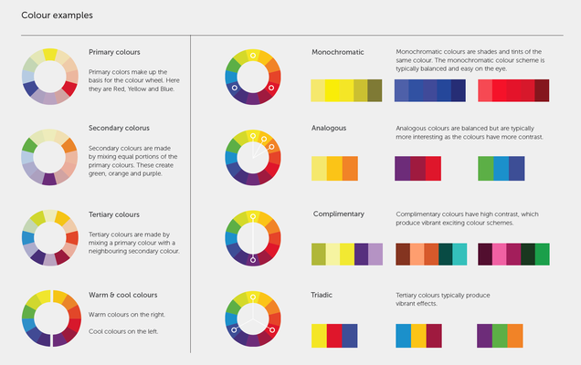
2) Color Visual Element
Color plays one of the biggest impacts in Graphic Design.
It can create emphasis, be a mechanism of organization, create impact or create a specific look or feel.
It is important to have a strong knowledge of color theory.
This will provide us with practical guidance to help us mix colors and create interesting color combinations.
All this starts with the color wheel.
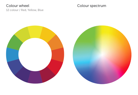
Primary: Red, Yellow, Blue
Secondary: Purple, Green, Orange
Tertiary: amber/marigold (yellow-orange), vermilion/cinnabar (red–orange),
magenta (red–purple),
violet (blue–purple),
teal/aqua (blue-green),
and chartreuse/lime green (yellow–green)
Other important color groups:
- Warm and Cool Colors
- Monochromatic colors
- Analogous Colors
- Complementary Colors
- Triadic Colors
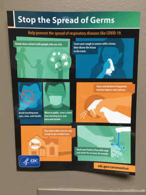
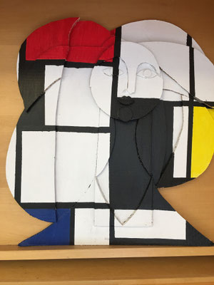
Good and Bad examples:
Left is Good because they are using color to separate different sections of the poster.
Right is bad because it is not graphic design. It is a painting using color. However, this is a good example of Bauhus.
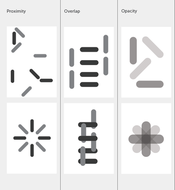
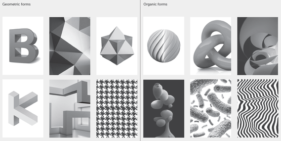
3) Shape Visual Element
Shape is used to add interest or substance to a piece of Graphic Design.
They decorate, symbolize, or add patterns and textures.
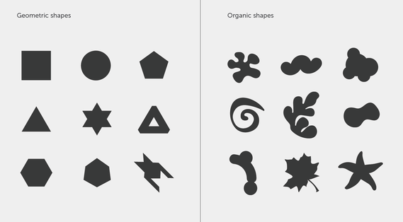
There are two types of shape; geometric and organic.
When placed together it creates a relationship.
These relationships trigger feelings, convey messages, engage an audience, add emphasis to a portion of layout and create movement.
(Proximity of shapes is crucial to these relationships)
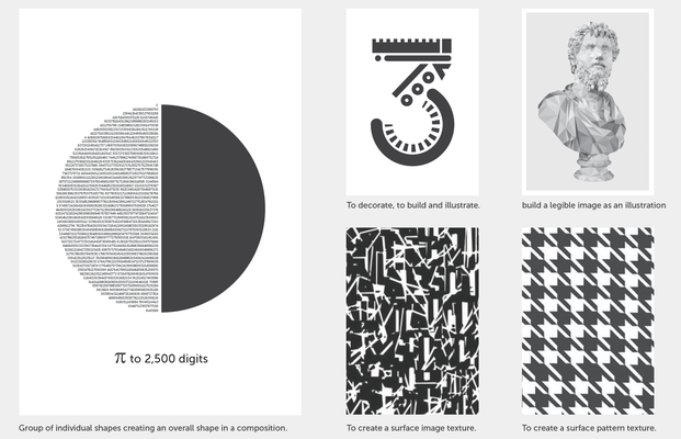
In graphic design, Shape is an individual element but, when placed together as a group shapes can form compositions and become visual elements.
Shape is what makes up the foundation of any composition.
These can be Simple or Complex.
In Design 'Shapes' have two dimensions and are measured by their height and width.
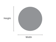
Shapes are defined by boundaries, such as a lines or color can also be created with negative space.
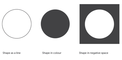
Examples of shapes
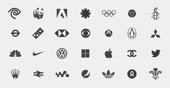
Examples of Logo Shapes
Examples of Shape in Design
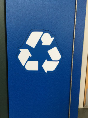
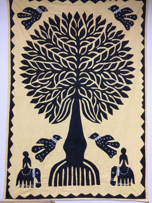
Good and Bad examples of shape:
Left the use of simple shapes to create the "graphic symbol" for recycling is good.
The interesting shapes used in the tapestry is not graphic design so is a bad example.
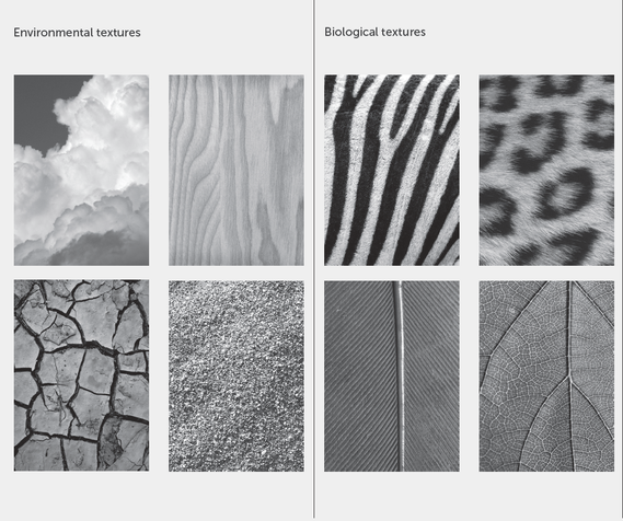
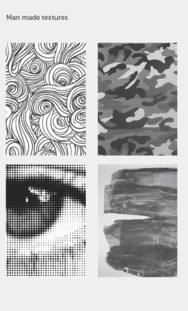
4) Texture Visual Element
Shapes are defined by boundaries, such as a line or color and can also be created with negative space.
Texture is the way a surface feels or is perceived to feel.
It is used to create a visual tone.
Texture can attract or repel attention to a visual element.
It can be used to excite the visual senses.
There are Two types of texture.
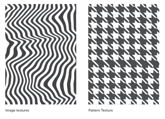
Image texture examples:
Pattern texture examples:
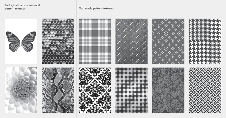
Above are two examples of different kids of texture that have been used in Graphic Design.
Some Iconic styles, eras of design, fashion trends and social movements have been defined by their textures.
- Bauhaus
- Neoclassical
- Art Deco
- Psychedelic
- 80s Pop
- 90s Hip Hop
- What might be something for the time you live in?
5) Space - Visual Element
Space creates the visual essence and dynamic of a composition.
There are two kinds of space:
Positive and Negative
- Positive can be perceived as 2 or 3 dimensional.
This refers to shape of objects, it refers to the main focus of a page or design.
- Negative is the empty space or space between visual elements.
This space is just as important because it frames and contains the visual design.
It connects or disconnects and suggests relationships between shapes.
It helps to create balance.
Positive and Negative space can be used to create a focal point, balance, set a visual tone or define a look and feel.
The two types of space in graphic design;
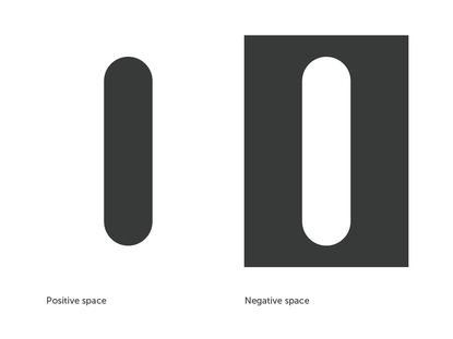
Examples of space;
Positive and negative space are essential aspects of Graphic design.
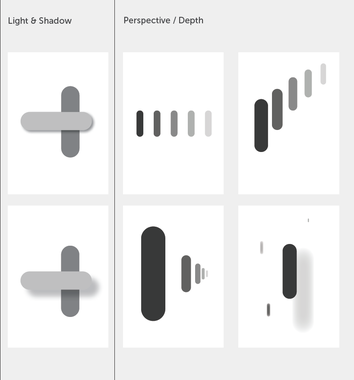
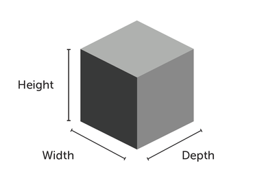
6) Form - Visual Element
Form is described as any three-dimensional object. 'Forms' are the 3D equivalents of shapes and as such are measured by their height, width and depth.
Form can be defined by the presence of shadows on surfaces of an object and can be enhanced by tone, texture and color.
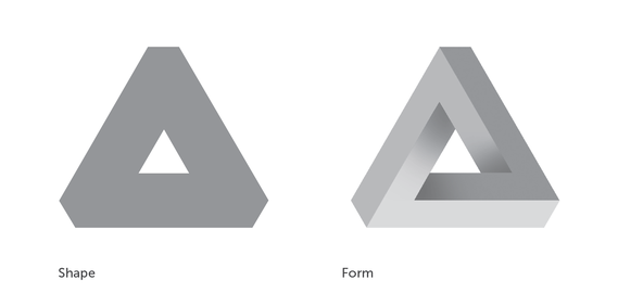
A Great example of the use of form in graphic design. They have used shading to help give the illusion of depth in the design.
This could also be an example of use of color or shape or even line and typography.
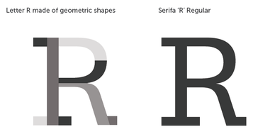
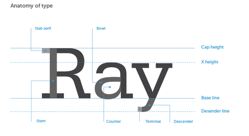
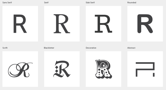
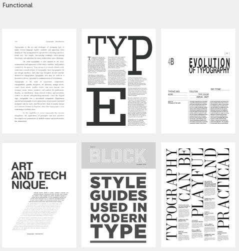
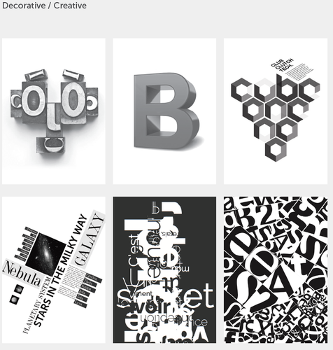
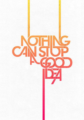
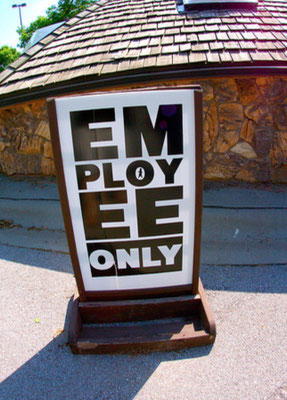
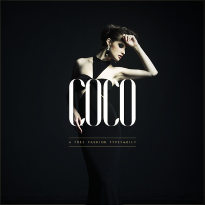
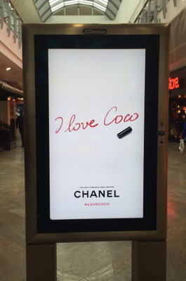
7) Typography - Visual Element
Typography is one of the most commonly used elements in Graphic Design. It is the most direct way to communicate visually.
Every type face has its own voice with its own accent and dialect.
It is extremely important to choose the best or correct typeface to set the intended look and feel, set a tone and character to a piece of work.
Type can be functional and decorative. The way type has been arranged and the relationship given to it to other elements in composition has re defined type in design.
In Design, type can be used to communicate literally and to tantalize the visual senses or to engage emotionally.
Type category examples:
Examples of use of type:
Find four examples of type being used as a main element in graphic design.
Use your iPad, phone or even off the internet to collect four images/example that show how type has been used in a "graphic design".
Post these to your portfolio with your explanation as to why and how type has been used in the design.
Use complete sentences.
Good vs Bad use of Typography.
IGNORE THIS BELOW!!!!!!!!!!
Copy this link into your portfolio.
This will be used as a self reflection and assessment tool.

After you have completed all of the projects above and have downloaded the link above this text. Take a minute to look over the link. Asses your personal habits and then see Mr. Vincent.
How to post your work in the e-portfolio and submit it for grading through the onCampus assignment portal
- Make sure you have published your site and are in live view.
- Copy the URL to your site from the correct Unit.
- Open your onCampus assignment portal.
- Paste the URL into the Box on the upper right. DO NOT ATTACH AS A FILE!
- You must do this with each project so that it is recorded as complete and handed in.