 Burr and Burton Academy
GRAPHIC DESIGN
Burr and Burton Academy
GRAPHIC DESIGN
PRINCIPLES OF GRAPHIC DESIGN
Principles of Design (tasty tuts)
STOP!!!
I have changed the expectations for this page and set of projects!
For each Principle, I want you to read the text, look at the examples and watch the short video for each.
Once you have done that, You will need to go out and find one "real life" example for each Principle and photograph it with your iPad.
You will then post the example on your portfolio with a written explanation as to how the specific Element is being implemented in the example you found.
The only project you will do physical work for is the "Balance" principle.
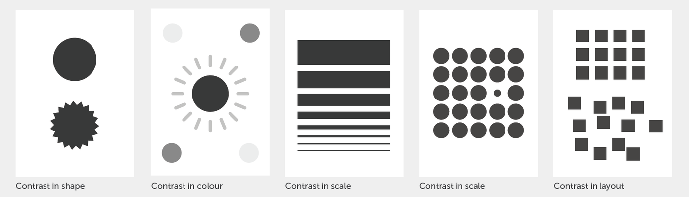
1) Contrast - Design Principle
Contrast occurs when 2 or more visual elements in a composition is used to generate impact, highlight importance, create exciting graphics and visual interest.
Context is integral to contrast.
We may think that the chosen visual object in a composition says something about itself. But it is more often the visual element around it that give it its meaning.
Contrast occurs when two or more elements in a composition are different.

Examples of Contrast.

Find one real life example of Contrast. Look through magazines, posters, signs, packaging to find your sample. Do not take this off the internet.
Photograph your found sample and upload it to your portfolio.
2) Hierarchy - Design Principle
Hierarchy is typically created by contrast between visual elements in a composition typically visual elements with highest contrast being noticed first.
Establishing clear visual hierarchy is important, because it holds a design together. Used effectively hierarchy can make a complex message simple.
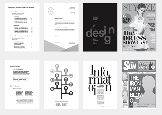
Basic Hierarchy Examples:
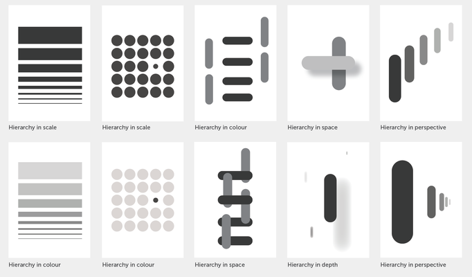
Common Practical Hierarchy Examples:
Find one real life example of hierarchy. Look through magazines, posters, signs, packaging to find your sample. Do not take this off the internet.
Photograph your found sample and upload it to your portfolio.
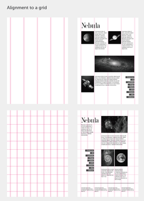
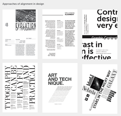
3) Alignment - Design Principle
Alignment can be used to achieve a particular look and feel.
Once should always be conscious when working with alignment to achieve the intended result.
In Design one should avoid the appearance of having made arbitrary decisions when visual elements are out of alignment it is noticeable, and can devalue a piece of work if done unintentionally.
But, if done intentionally it can be radical, dynamic or free.
The use of a grid can be useful to achieve proper alignment.
Alignment Principles:

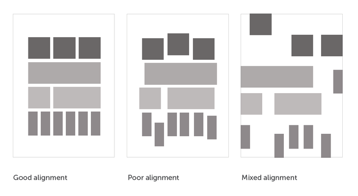
Alignment Examples:
Find one real life example of Alignment. Look through magazines, posters, signs, packaging to find your sample. Do not take this off the internet.
Photograph your found sample and upload it to your portfolio.
4) Balance - Design Principle
Balance is the visual weight within a composition.
Balance is used to create stability, structure, emphasis, and dynamics.
In design one attempts to place visual elements in an aesthetically pleasing arrangement, or particular arrangement to fulfill a purpose or achieve a particular look and feel.
There are three main types of balance;
Symmetrical Balance (formal)
Asymmetrical Balance (informal)
Radial Balance
Three main types of balance:

Balance Examples:

Follow This Link to complete the project for Balance

Photograph your creation and upload it to your portfolio.
5) Proximity / Unity - Design Principle
Proximity is the grouping and shaping of objects in a composition.
Proximity is used to create relationships between elements. Creating relevance, hierarchy, organization and adding structure.
It can also be used to dispel connections, suggesting no relationships between elements. Breaking organization and structure.
Moving elements closer or further apart helps to show the relationship or lack there of.
In design elements should be grouped together so that they will be viewed as a group.
Un related elements should not be in close proximity to each other.
Audiences will assume that elements that are not near each other in a design are not connected.
One should try and avoid appearance of having made arbitrary decisions.
When visual elements appear randomly or poorly positioned, it is noticeable, and can devalue a piece of work if done unintentionally.
Proximity can make the difference between good and amazing design.

Practical examples of Proximity layouts:
Good vs Bad


Find one real life example of Proximity/Unity Look through magazines, posters, signs, packaging to find your sample. Do not take this off the internet.
Photograph your found sample and upload it to your portfolio.
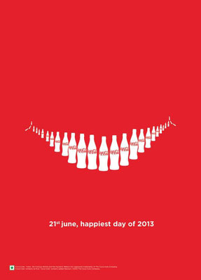
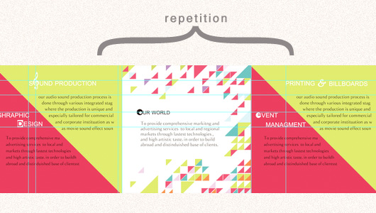
6) Repetition / Movement - Design Principle
Good design practice, seeks to repeat some aspect of a design throughout a piece of work, be it for a simple or complex piece of work.
Repetition in graphic design does not mean pattern.
Repetition in used to represent unity and consistency throughout the design.
Repetition creates a particular style and creative cohesiveness, creates emphasis, higherarchy, structure and strength into a design.
The ultimate goal of any piece of Graphic Design is to make an impression, hopefully a lasting impression. If a design achieves this goal, it will be fulfilling its purpose, to communicate and insist upon a particular message which lingers and becomes familiar.
The more we see something the more we become familiarized with it and in turn remember it. Think of coke a cola.
"Repetition is memorable"
Maintaining visual structure throughout a design promotes focus and consistency.
Find one real life example of Repetition/Movement. Look through magazines, posters, signs, packaging to find your sample. Do not take this off the internet.
Photograph your found sample and upload it to your portfolio.
QUIZ
Read through this Link and take notes. You can use your sketchbooks or iPads or online portfolios to take your notes.
There will be a quiz based around the terms on these pages.
You only need to know 1 - 46
Elements and Principles Design Combinations.
Sample Link: