 Burr and Burton Academy
GRAPHIC DESIGN
Burr and Burton Academy
GRAPHIC DESIGN
Use this link to get to your Online Portfolio
If using a laptop or desktop; sign in to your email
Search for Google sites Google sites: Sign in or New Google sites
Choose either the "Student Portfolio" or "Photo Portfolio" template.
Dress it up any way you wish but, You do need to have a home page.
On your home page include Your Name for the site and at least one photograph. (this will be for the first project.)
There will be a few Units for this class so create at least three other pages, one for each Unit.
Portfolio Setup
PORTFOLIO SETUP
Simple first day project.
Create a Google Site to be your class Portfolio.
Take a photo with your iPad upload it to the Home Page of the new Google site you created.
Copy the URL of the home page and submit it to OnCampus in the text field corresponding to the specific project.
Make sure you have published your site and you are copying the URL of the published site!
PROJECT #1
What is Design / Inversion Design and its Process
Watch the following video:
Step 1 - Watch the Following Video as a class.
IDEO Shopping Cart
Step 2 - Take notes in your sketchbook or directly in your e-portfolio and discuss as a class
A more detailed explanation of the steps of the design process.


From: Ulrich


In the video you just watched, Prof Ulrich described a small design challenge that he used to illustrate some of the differences between art and design. He called it an inversion. In this design challenge you will create your own name inversion.
- Your inversion must meet the following criteria:
- You must use your real name (first or last) or actual nickname.
- Your inversion must be able to be clearly read from either side. (Picture two people opposite each other with the paper between them. Each should be able to read the name).Your inversion must follow the model in the video (study the photo above for reference)
Your project must use ALL of the following steps
- Using a 8.5x11 piece of paper take the time to sketch out your name on the paper. You ned to try different iterations in order to find the correct combination of elements that will produce the best results. This could be five or 500
- Find a partner in class and have them critique your prototypes. Have a conversation about your work. Make notes on your drawings to record their feedback. Switch roles and repeat the process. 15 min
- Select the best of your prototypes and on the OPPOSITE side of the paper create a refined version of your inversion. This final version should be as large as can comfortably on a piece of paper. Try to refine your initial prototype, by incorporating the feedback of your partner. Do your best work. 15min
- Take a total of 3 photos (1 of your prototypes, 2 of your final inversion from BOTH perspectives)
- Upload ALL 3 photos into your MY MEDIA STUDIO folder and then insert them into your e- portfolio under the Inversion heading (Project. 10 min.)
- Under your photographs write a short reflection.
Please answer in complete sentences and use the following questions to guide you:
Written Reflection:
- Was it easy for you to develop four prototypes –why or why not?
- Describe the experience of having someone critique your work was it useful – how did it make you feel?
- Describe the evolution of your inversion from its original prototype to its final form – how did it change?
- If you were to continue to refine your inversion to make it even better, what would you do next?
- Overall how did you feel about this design challenge - did you find value in it – would you recommend that we keep it in the unit?
PROJECT #2
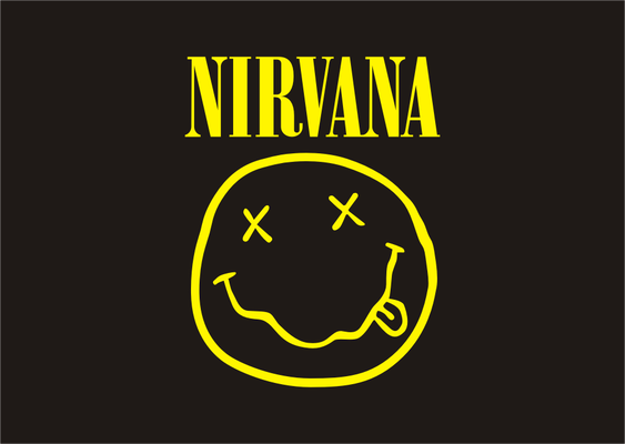
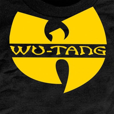
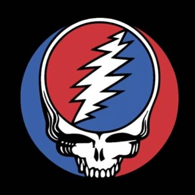
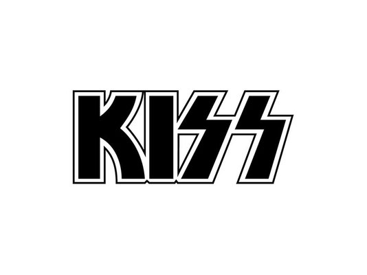
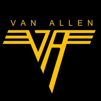
LOGO HUNT
You are to look around your home/school and find 4 logos.
Once you have found a logo you need to record it with your device and upload them to a google slide presentation.
Each slide should have one logo with answers to the following questions:
- What is the logo for?
- What kind of logo category does it fall into? Use the 7 examples from link above.
- What drew your attention about the logo?
- What colors are being used?
- What shapes are being used?
- What kind of fonts are being used?
- Who is the logo designed for? Think about the consumer.
- Do you think the logo is or isn't successful and why?
- What do the colors that were chosen mean?
Once you are done, upload the presentation to your Design Google Folder (GF) and share the folder link through OnCampus.
An example:

PROJECT #3 & 4
Basics of Design
The next two projects are based on the Elements and Principles of Graphic Design.
The Elements of Design are like the Bricks.
The Principles of Design are how you put those Bricks together.
Please follow these two links in order.
#1 Unit 2 Elements of Design
#2 Unit 3 Principles of Design
You will be prompted to work your way down each page and study each Element or Principle. you will also be asked to complete a "Task" for each.
These are the building blocks of Graphic Design. It is important for you to understand them and how to utilize them to help you produce the best work possible.
Once you have an understanding of them it will help you with future projects which will require you to use them to make awesome stuff look even more awesomer!
Abstract Element and Principle Design Art
DESIGN PROCESS
The graphic design process describes the different stages of a design project. It can be broken down into five sub-processes (definition, research, Ideation, verification, and evaluation / delivery) and consists of 9 single steps. This approach can be used for almost every design project:
This approach can be applied to nearly every design project:
Definition Phase
- Step 1: Creative Brief (what your purpose is)
- Step 2: Graphic Design Research
- Step 3: Brainstorming / Mood Boarding
Research Phase
- Step 4: Current examples
- Step 5: Purpose
- Step 6: "Client interview"
Ideation Phase
- Step 7: Sketching
- Step 8: Design Building
- Step 9: Refining
Verification Phase
- Step 10: Presenting
- Step 11: Revisions
Evaluate / Deliver Phase
- Step 12: Final Delivery
Project #5
Logo Design
You are to create 4 logos using the logomarket.com site.
This is a very quick logo design site that will let you use basic symbols and lettering options to create basic logos.
I'm not expecting anything extremely detailed but more looking for you to understand how Font, Color, Shape, Alignment, Proximity all play their roll in creating a basic logo design. There should be a reason for why you are using elements in your designs.
You could also use logomaker.com (it is okay but not as open as logomarket.com
Other Logo Design sites: The best sites are the ones that let you choose all components of your design to put together yourself. Not the ones that design the logo for you.
Once you have created the logos (individually) you will need to screen shot the logo to save them. logomarket does not let you save your designs unless you purchase or sign up. (if you wish to sign up that is fine, up to you.)
Once you have "saved" your logos, upload them to your Portfolio,
add a description for each design explaining what it is for and why you chose the colors and fonts you did.
Submit the "Published" link onto OnCampus
PROJECT #6
ADOBE ILLUSTRATOR
You will now take your sketches and convert them into a digital "Vector" format.
You will be using Adobe Illustrator to do this.
Before you begin working on your digital creations take the time to go through the links below to learn the basic tools of Adobe Illustrator.
These tools will be used to help you create your Design Projects for the rest of the semester.
To Begin, create one new document and practice each of the tools on it. In the end you should have one document with all tool practice which you NEED TO SAVE and
post to your portfolio.
Setting Up Illustrator
PEN TOOL
SHAPE BUILDER
BLEND TOOL
GRADIENT TOOL
BASIC TYPE
TYPE ON A PATH
TOUCH TYPE
Once you have watched and practiced the tools take what you have learned and use them to help you create the following projects.
When you complete your design, EXPORT it as a PNG file and post it to your portfolio along with the sketches of you initial design ideas.
Here are a few links that will give you options to incorporate your logo into character designs.
Project #7
Vermont Promotional Poster:
You are to create an 11x17in poster that promotes the state of Vermont.
You MUST use your sketchbook to get you ideas out onto paper before you go anywhere near the computer software! You MUST show Mr. Vincent your ideas before you begin working on the computer.
You can use images or drawings or any other ideas you can come up with. Because this is a "Learning Project" where you will implementing the Illustrator software for the first time you man NOT use any AI program to produce any part of your design.
You need to have a tag line that sums up something about the state.
"Vermont, the Green Mountain State" for example. Try to be a bit more creative than that.
Think about the composition of your poster. Remember the Elements and Principles.
What fonts and colors you use and how they relate to the purpose of your design.


Project #8
NOW's THE FUN PART
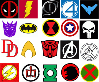
Would you rather be a villain or a hero for a day? Well now is the time to create the symbol/logo for your hero/villain.
A superhero logo is a visual symbol used to represent a superhero. It is typically designed to be used on a variety of media, such as clothing, merchandise, and marketing materials. A good superhero logo should be easily recognizable and memorable, and it should be able to convey the superhero's personality and theme.
Here are some tips for creating a superhero logo:
- Start by sketching out your ideas. This will help you get a sense of what your logo might look like and how it might evolve as you work on it.
- Consider the color scheme of your logo. Colors can have a strong impact on the overall look and feel of your logo, so choose wisely.
- Think about the shape of your logo. A circular shape can be seen as friendly and approachable, while a more angular shape might be seen as more serious or powerful.
- Use negative space to your advantage. Negative space is the empty space around and between the elements of your logo. It can be used to create visual interest and balance.
- Keep it simple. A cluttered or overly complex logo can be difficult to understand and remember. Aim for a clean, straightforward design that clearly communicates your superhero's identity.
- Test your logo out in different contexts. See how it looks on a t-shirt, a poster, or a website. This will help you get a feel for how your logo will be perceived by others.
You need to come up with a name for this individual superhero/villain character or organization (think of the fantastic 4 or avengers).
(you can use this name generator) if you can't come up with one on your own.
First sketch your hero/villain logo design in your sketchbook. I want to see several iterations (variations) of your sketches before you can move to working on the them using Illustrator. 6-8 iterations at least.
Think about the relationship of the logo you create and the character you are creating it for.
What are the characteristics of hero/villain?
Do they fly, strength, laser vision, speed, etc.
Shapes that may be associated with the character, colors etc.
Use your iPad to photograph the sketches you did and post them to your Portfolio.
Write a brief description about who your character is. What are their abilities and why you chose to design the logo the way you did.
Submit the "published URL" of your website to onCampus.
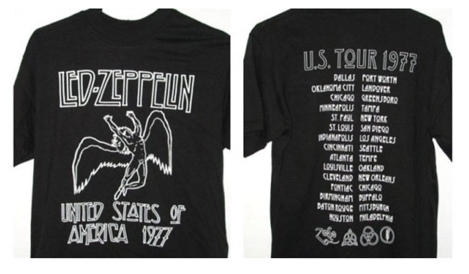
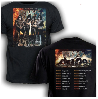
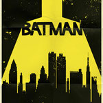
Examples of Hero Logos/Symbols
Project #9
Snowboard Design
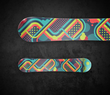
Create a colorful snowboard design by following the tutorial below.
This will teach you how to create your own brushes and patters that will be very helpful in the projects that follow.
You do not have to use the specific colors they suggest. Make it your own.
Snowboard Tutorial: Video Version Tutorial
After you are done with the design of your snowboard, dowload the link below to "Cut" the shape of your board to the necessary shape.
Save your artwork as "Snowboard Art".
You will need to group all of your artwork before cutting your shape.
Open the link in Illustrator. Copy the line drawing and paste it into your artwork artboard. You will have to resize the board outline to the size of your artwork and place it on top of your work.
Once the outline is on top of your art hold shift and select your artwork. (both the outline and our art will be selected).
Hold down the command key on your keyboard and press the number 7. This should crop all of the work to fit the shape of the snowboard.
Caution: Before saving make sure you rename the artwork as "Snowboard Crop" or it will overwrite the original!
Export both the artwork and the cropped work as PNGs and post on your portfolio with a reflection about the process and tools used.
|
Project Description: A) Describe the challenges you experienced maintaining a proper mindset while working on this project. i.e., Curiosity, time management, impulse management, persistence & preparation, ability to collaborate Mindset- 1. What were your challenges and why? 2. What strategies could you use to improve? B) Describe your ability to explore creative solutions while working on this project. I.e., Ability to understand the expectations of the project, ability to find information to solve the challenges presented, ability to derive multiple solutions, ability to verify and test your work, ability to self reflect on your progress. Thinking Skills: 1. What were your challenges and why? 2. What strategies could you use to improve? C) Describe your ability to improve upon your content knowledge and skills during this project. I.e., Ability to expand on prior knowledge, use appropriate materials, develop new technical skills and procedures and understand how the work of the project can improve your overall performance and understanding. Expertise Development: 1. What were your challenges and why? 2. What strategies could you use to improve? |
Project #10
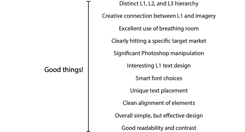
Business Logo Design
Read this Logo Design Rules article.
***12 Essential Rules
Also take a look at these business logo design processes. They can be very helpful for your Design Thinking Process!
No Logo has ever been created the first time it was drawn!
You as Designers need to take pride in the work you are doing and refine, refine, refine until you produce the best work possible.
Take a look at the revision sample for the Metro Aviation Logo by:Chuck Green
Controlling Type for Design.
Typography is an integral part of Graphic Design. Sometimes it's simple and other times more complex.
When creating Logos with typography we need to know ways to manipulate type other than just the click and type with a basic font so that we create our own style. This can be with color adjustment or even making it a custom /dimensional object.
You are to design a logo for a fictional company, non-profit organization, product or event of your choosing.
The process of the logo design is just as important as the final design itself.
See Mr. Vincent for Design Packet.
Step 1
Target market
You can begin by researching demographics to focus on age group, income levels and geographic location.
But it isn’t all about the demographic. In Graphic Design, your graphics can appeal to different consumers based on their
personal interests or hobbies. So, you’ll want to ask yourself:
- What are their hobbies?
- How do they spend their time when they aren’t going to school or working?
- What are they interested in? Sports, music, movies?
- What products do they buy?
- What interests them?
Try to put yourself in the shoes of your target audience. Think about what would catch your eye if you were this individual. What colors, pictures or designs would you respond to.
It is very important to plan where your design is going to be appear (correspondence, presentation, retail, signage, broadcast, print advertising, packaging, internet or more?)
Does it need to translate Across Cultures and Languages?
Step 2
Type of Business, who are you designing for?
Non-profit organization, for-profit business, specific product or event.
What are the differences?
Step 3
Planning for your logo.
1. You will design a logo for a fictitious for-profit business, non-profit organization, specific product or event.
2. Create a name for the entity.
3. Describe what this entity does. Be clear because nobody has ever heard of them before.
4. Clearly describe their target market. Include information on their gender, age, lifestyle and socio-economic status.
If you are having a difficult time coming up with a name for your company you can use this site. Name Generator or any other name generator. Choose a few names to work with and think about how they will be used throughout the entire process.
USE THIS DESIGN BRIEF TO HELP WITH IDEA PLANNING
Step 4
Brainstorming
List as many things that relate to the entity as possible. There are no wrong answers at this point. Brainstorm! Use the internet. Ask friends. Ask your parents. The more you come up with, the easier the next step will be!
Step 5
Thumbnail sketches
Thumbnail sketches are small (thus the name 'thumbnail') and quick. The emphasis is on the logo CONCEPT as opposed to the drawing ability. CONCEPT, CONCEPT, CONCEPT!
Remember to keep your concepts SIMPLE! Text is a vital element of a logo design so don't forget about it.
Remember the professional techniques that you clipped out of magazines: reversal, attach to path, comstock (offset path), hard shadow, replace type with image, type modification, & type contrast.
Extra credit will be awarded for generating more thumbnails than are required.
Step 6
Rough Sketches
Narrow down your thumbnail sketches to the 2 concepts with the most potential. You will be working on these 2 concepts exclusively from now on. Choose concepts that are creative and follow the rules of effective logo design.
Use a pencil to refine these concepts so that they clearly communicate your concept to your client. Drawings don't need to be perfect, but they do need to account for placement, proportions and clarity.
Imagery is not a requirement, but if you choose to use imagery then make sure that you can create it yourself using Illustrator.
Show all your sketches to Mr. Vincent before moving on to the next step.
Step 7
Digital rough sketches
Use your Illustrator skills to create digital versions of your 2 rough sketch concepts. Explore fonts. Carefully consider text size and placement.
Design in black and white for now.
Explore further versions of one of your concepts? This is VERY real world. Try different configurations, layouts, reversals, etc. Keep the concept the same, but experiment with alternate versions. Usually, you'll stumble upon an even better design.
Try different color backgrounds, invert the colors, light on dark - dark on light.
Step 8
Finalize the logo.
This is the place to fine tune it. Attention to detail is key. Nail down exact colors. The final logo is a 2 or 3 color design...not 1 color, not 4 colors.
List to color mixes used for your design with your work.
Layout and placement very important because this is the logo that is locked. It won't ever change.
Step 9
Design Mockup
Place your design in a mockup situation using a Photoshop mockup. Think about where you would expect to see your logo in real life; On a hat, on a sign, bus stop, coffee mug, office window, etc.
Company/Organization Info: Briefly explain who this company, organization or event is. Who is their target market? You have ALREADY DONE THIS! Refer back to step 3.
Concept Brief: Briefly explain the overall concept of your logo. Explain WHY you designed the logo concept the way you did. You can probably just copy/paste most of what you wrote for your rough concept.
Print out final design on Art Color HP attach to packet and hand in to Mr. Vincent.
Upload all digital files to your portfolio in order with notation to each step of the process.
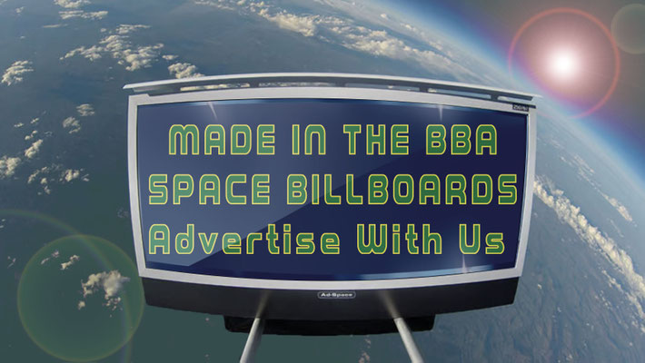
Project #11
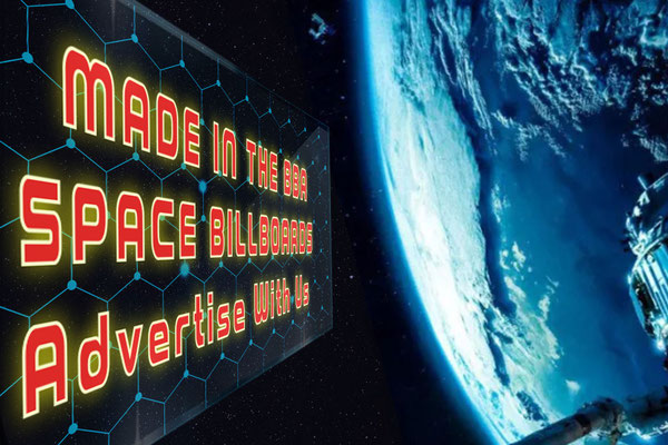
Universal Advertising (literally)
You have been hired by a "stellar" new Advertising Firm to help design a new campaign for their out of this world billboards.
Picture this, You are planning a getaway and not just any getaway one that will have you reaching for the stars. You have packed you bags and are now sitting in your seat ready to blast off to the next closest planet, Mars! As the rocket blasts off and you pass through Earth's atmosphere and there they are, new majestic "Satellite Billboards" informing you of the out of this world adventures you are about to experience.
Or, There is an extraterrestrial visitor on their way to Earth and as they make their way towards our planet they are welcomed by our new "Satellite Billboards" letting them know what wonders to expect when they touch down on our terra firma. Perhaps a billboard ad for "Barny's Burger Joint, the best burger this side of the Milky Way!" or "Experience the Great Wall of China in person not just from space." (would an extraterrestrial being be called a person?).
The choice of what you advertise is yours, what do you think would be good for either scenario.
You must use more than just text in your design, you can use images found off the interweb but you must edit the images to make them your own.
Use the design thinking process and the design brief concept to help stay organized. Use your sketchbooks!
You will be required to share your ideas with Mr. Vincent before you begin working on the computer.
Once your design is completed you must add it to one of the "Space Billboard" mockups.
Post all of your sketches, Final design and billboard mockup onto your website.
You are free to make more than one!


Group Design Project
You will be divided into small groups. This will be your "Design Firm" for this project.
You will choose a random company/business that will be your target client for this project.
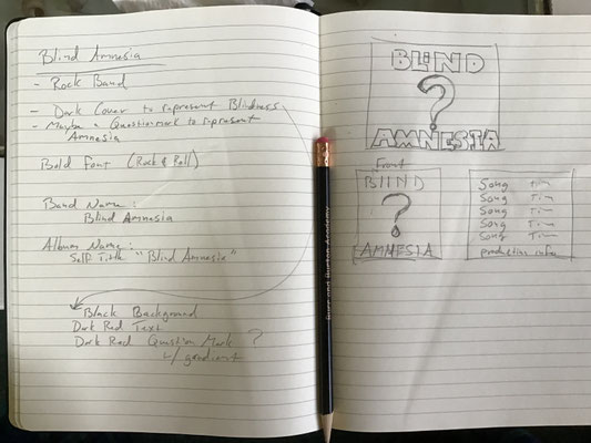
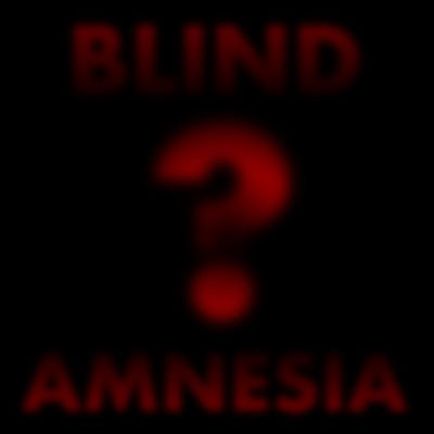
Project #10
Album Cover
Music Album cover Design. Downloadable Design Brief
This is a bit different than the one you may have done for the foundations class.
There will be more planning and design put into this instead of picking from random wikipedia pages.
You have been hired to design the cover (front and back) for a band/artist/group.
There are hundreds of styles of music that you could choose from.
Here is a wiki page full of styles. WIKI
Take some time to look through this list, maybe even try to listen to a few of them (within reason, this does not give you permission to become distracted from the work in class) and pick one you will base your project on.
You will need to have a band name Band name generator
and a name for their album.
You will be required to implement the Elements and Principles of design into both the front and back of the album.
Being mindful of the images, fonts, colors and other elements you may use. The design needs to be clean, organized and done with purpose.
Project Dimensions: 10inx10in two Artboards
Front Cover must have:
Band name
Album name
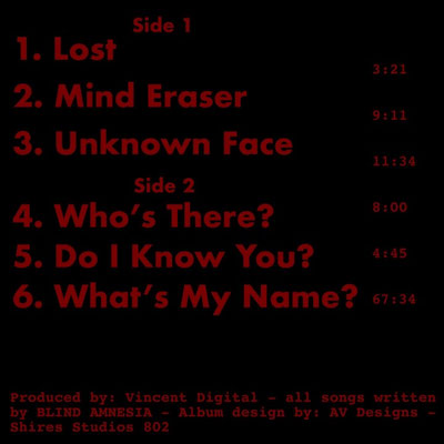
Back cover must have:
Song list (with times) Albums have two sides so split your song list.
Side A (or Side 1) and Side B (or Side 2)
An average vinyl record can hold about 23 minutes of music per side so take into account the length of each of your songs.
Production info and recording location, look at examples on line.
Copyright info
Bar Code, so the album could be sold.
On the back of an album cover, you may want to include:
- your track list
- production credits
- label name
- producer’s name
- catalog number
- barcode
- contact information
- website URL
- email address
- social media information
The back cover of the album should include the album’s track list and play-times. The typography can be different here than on the front cover, but it should still communicate stylistically and be easy to read.
Extras to consider:
Explicit language label
Price tag sticker
Critic review sticker
Your design should relate to the style of music / time period / and Band name.
Use this Photoshop Mockup or one similar, to put your design into.
You can use the app Adobe Photoshop express to help you with the design. if you are not on campus
What do different colors represent?
Red: passion, anger, love, confidence
Orange: youthfulness, cheer, warmth, hunger
Yellow: sunshine, happiness, energy, optimism
Green: nature, fertility, balance, cleanliness
Blue: water, tranquility, trust, power
Purple: nobility, power, elegance, wisdom
White: peace, balance, purity, simplicity, winter
Gray: neutral, sophistication, balance, wisdom
Black: exclusivity, modern, power, sophistication, mystery
Brown: earth, stability, tradition, nature
Pink: love, romance, femininity, baby girls, humanistic
Turquoise: tranquility, clarity, compassion, healing
UPLOAD YOUR FINAL COVER MOCKUP HERE
Here is an example of what I am looking for.
Sketches for design with basic ideas and sketches.
Front and Back sides of the Album.
Take things to the next level and design a logo for your band.


PROJECT #11
MUSIC PROMO
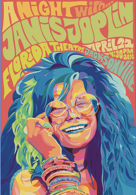
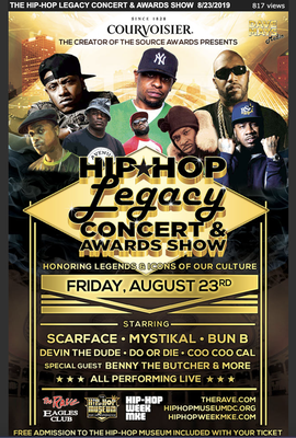
Music Concert / Promotional Poster
Now that you have come up with the Band and their first album, it is time for you to promote their first world tour or first concert.
You are designing something that should use images and proper use of Typography and proper use of the Elements and Principles of design. There should be use of three typographical hierarchy. Most important, Important, Necessary.
Do research on the types of promotional posters that other competitive music artists have done in the same genre of your “Artist’s” music. Inspiration is GOOD, copying is BAD.
Download images and ideas to a specific folder in your desktop folder. Keep all citing information associated with the images you use. (Use a google Doc.)
Search for advertisements/posters/that fall into the general realm of your client’s musical style. Include 5 good examples from the list. Identify and label each example.

Create a gallery of images on your portfolio to show ALL the image examples you are inspired by. (Use the 4 image pre set template to place on your portfolio) record the website link under the images you choose.
You can use images from the internet to help you create your poster, HOWEVER, you MUST cite all information for each piece you use and you MUST edit the images in some way to change them.
Use the Design Packet to help you organize your thoughts and sketches. Have Mr. V sign off on your sketches and check you design ideas BEFORE you begin designing on the computer. You can use photoshop to help with image editing.


UNIT 6 - Retrofy That Movie
"Retrofy" the art of a Movie from today
Choose a movie from the past 6 years, the subject can be anything however it may be best to choose one that you have seen of have some interest in.
Research the artwork of movies from back in the 70’s, 80’s and 90’s. Collect different examples and post them on your website.
You will be taking to movie you have chosen and “Retrofy” its artwork to match the style from one of the decades you choose.
What would DUNE look like in 70’s Star Wars style?
Sketch your ideas. See Mr. Vincent before you begin working on the computer.


You will need to place your finished work onto a VHS mockup.
Make sure you post all steps on your portfolio.
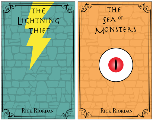
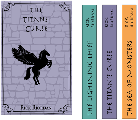
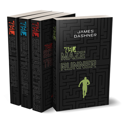
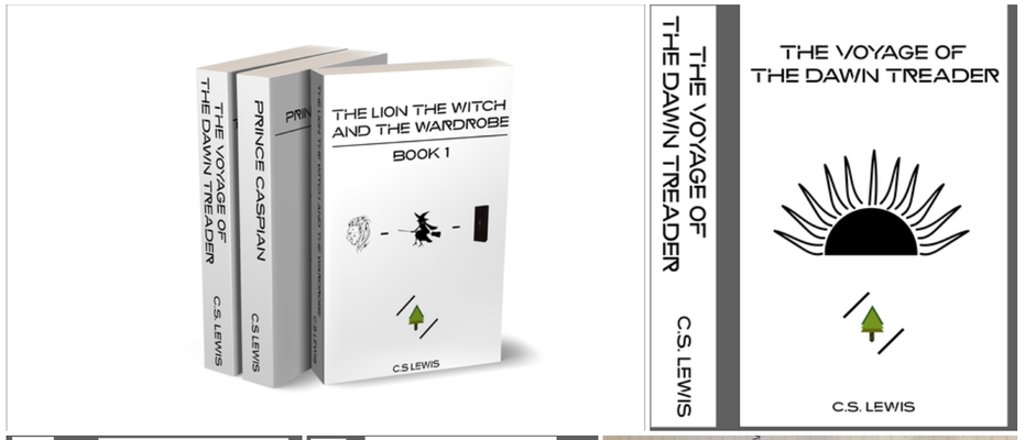
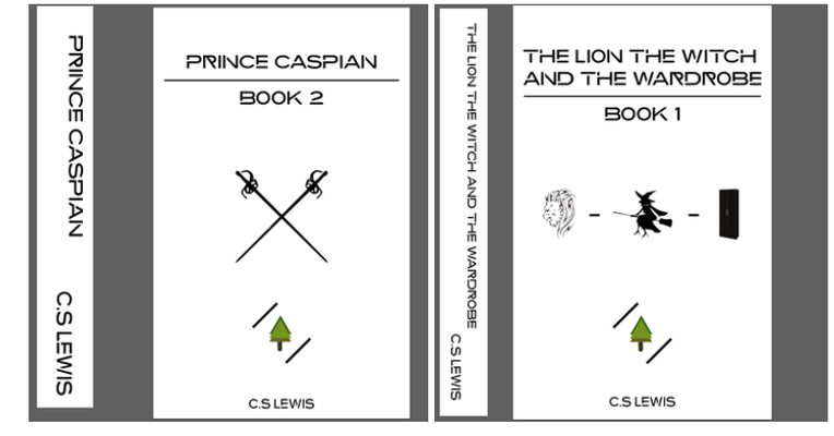
UNIT 6 - BOOK JACKETS
Follow this link to learn Adobe Illustrator Tools.
Follow this link to learn Vectornator tutorials
Book Jacket Design Series:
Find a popular book series and design a cover for each book.
Make the covers connect in some way.
No more than 4 books (don't attempt to design new covers for a set of encyclopedias!)
“Books cover designs can derive from one sentence or crystallized moment in a book. So the book needs to be boiled down and distilled to its basic elements. The main central theme of the book is what you are searching for. This is what should be represented on the cover.”
One cover per book, you do not need to create the inside flaps of the book Just the cover and spine.
The dimensions of the Book cover are:
5in W by 8in H
The spine dimension is:
1in H by 8in W
ORDER OF PROJECT:
1. Series idea choice - Due:
2. Sketches Due - Due:
3. Final Designs - Due:
There are, broadly, 3 types of cover to choose from:
| Lettering | Simple four-color lettering design, possibly with a patterned or textured background. | This might suit a textbook, or reference book, or the hardback case of a hardback book. |
| Photographic | Using an image that illustrates the book. If you don't have something suitable, the designer can find an illustration from a specialist archive. You might commission models and a photographer for the cover but this will be expensive. | This is excellent for historic or regional works. Make sure you own the copyright of any photo you plan to use. |
| Design | The designer will take your brief and produce some visuals. It is important that you are prepared to work with the designer, who will interpret your brief to provide a distinctive cover which you can discuss and revise. | This includes the designer producing a cover design or commissioning or finding an illustration. |
You need to consider:
- The theme or key image from the book that you want to use on the cover.
- Is there a particular character or scene from your novel you would like to show on the cover?
- Should there be a dominant color?
- Are there any visual clues such as badges or colors that will identify the content?
- Is the book designed to be part of a series? Does it need to match existing books?
Once the design is complete place your designs into a separate folder in your Remote learning Google Folder.
I will be adding your designs into mock ups to post onto the Unleashed Media site.
So make them as good as you can.
Be creative, have fun, remember the Elements and Principles of Design.
Samples
https://www.behance.net/gallery/18706791/Jane-Austen-Modern-Book-Covers
Student Examples
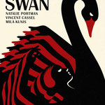
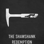
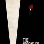
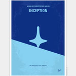
Movie Poster
Before you start working on the computer you must sketch your ideas in your sketchbook. This WILL BE PART OF THE GRADE!
In this assignment you will be re creating a poster for an already existing movie. Choose a movie from the past 10 years that you like or even dislike. The idea behind this is to create a poster using only the most important elements.
- What is the movie about?
- Was there any specific scene in the movie that exemplifies the theme?
- What might the basic color theme consist of? There should only be 2-3 colors total.
- Could it be broken down into basic shapes?
- What would be the simplest way to visually portray the movie to others in a way that they would recognize right away?
The document / Art board must be 11x17 (tabloid). When designing the poster you can only use 2-3 colors total including black. Think about the basic shapes, positive and negative shape, contrast and texture and proximity of their relationships.
Here are a few examples of what we are looking for.
You must include the title of the movie, main actors names and production information on your poster.
Post your final work (including sketches) on your portfolio along with a reflection about the process.
Why did you choose the movie you did?
What were the key elements in the movie that you used in your poster to make it understandable?
Why did you choose the colors you did?
What if any new tools did you use in your process?

SEE UNIT 5 FOR NEXT PROJECTS