 Burr and Burton Academy
GRAPHIC DESIGN
Burr and Burton Academy
GRAPHIC DESIGN
Advanced Portfolio
This page is for third level Design Students.
This semester is a time for you to build a strong final portfolio that you can share with colleges or prospective work possibilities.
The idea is for you to find a concentration that you would like to work on for the semester.
We will need to discuss this one on one to go over all your options.
I will also come up with a couple of projects that you will need to complete as the semester progresses.
ADVANCED TOOLS
There are tons of tools in Illustrator that can help you take your designs to the next level.
Not every tool is one that can or should be used for all your designs however, knowing how to use them will provide you with ore options when needed.
# 1 PHOTOSHOP LAYER BLENDING
Create a document using at least four of the provided images.
This can be a poster, album, book cover, sign, or what ever you can come up with.
You can also use other images that you choose outside of the given collection.
This will be primarily a photoshop project. You can use Illustrator for final layout and type but editing images must be done in PS.
This project will help you to learn how to blend images.
Tools used:
- Masks
- Gradient tool
- Paint Brush
- Eraser tool
- Layers
- Selection tools
- Content Aware
- Patch Tool
- Color correction
- Lighting effects
- Blending modes
- And more
See Mr. Vincent to get the Link to the image collection.
Student Example,
Dylan Burrow- 2022


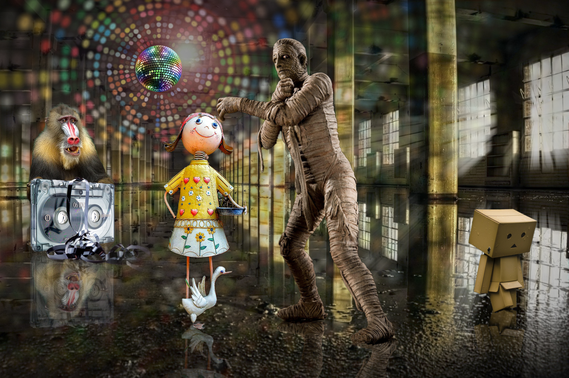
Mr. V's version.
Helpfull Links
# 2 Corporate Branding Design
As a graphic designer, your job is to help a company create its brand identity, starting with its color palette and logo design. From there you can put together a Collection of items that will help to showcase that businesses “brand”.
Keep in mind that all your design projects play a critical role in increasing your client’s brand visibility. You may want to take a page from some established brands and research what works and what doesn’t in marketing campaigns. You may also get inspiration from your potential client.
To increase any client’s brand visibility, uniform branding elements should be used in their marketing collateral, such as flyers, business cards and brochures. Your clients’ web design should also be consistent with their branding.
You must create no less than three of the following branding materials including a logo:
- Logo (required)
- Business Card
- Stationary (Letter head and envelope)
- Flyer or Info Graphic
- Bilboard / Display ad
- Trifold / Brochure
- Rack Card
- App Icon
- Social Media Graphic
Fill out a design brief for whichever company you choose.
You will need to document and present the color pallet you choose with the codes and font choices in all variations.
Site any resources and gathered inspirational examples.
Submit sketchbook with all preliminary sketches before working on the computer generated design. Check in with Mr. Vincent before each stage of the design process.
Product branding vs. Corporate branding examples to learn from
Business Options for Project.
Choose one of the businesses below to be your “business of choice”. You must use the information they have provided; there may be options to the company names but you must choose of of the options. Sometimes companies want to do a “re-brand” and these names are the alternative names they are thinking about.
#1) Name Options:
- ECOPMX
- Alpine Composite/s
- Skylinegreen
- Vermonix
Business:
Creates Polymer Matrix Composite Building Materials for green building ( Middlebury VT)
(Polymer matrix composite (PMC). Various fibers are connected together by an organic polymer matrix transferring the loads between fibers.)
Medium sized business with 250 employees Located in the green mountains of Vermont since 2006.
Design Preferences:
- Symbol - Tree, (Maple or Pine), does not need to be a central component of the design
- Shapes - No specific shape but considering we are a building materials business it needs to make sense.
- Colors - Green, Brown, Black, White, Grey
- Font - Strong Rigid Font, clean and shows rigidity and strength
- Could use initials but should include full name in subtext.
#2) Name Options
- Osprey Med
- Falcon Care
- Blu Eagle (Health or Med)
- Hawk Mountain Medical
Business:
New Private Independent Medical Office (Manchester VT)
Small independent medical office 5-10 employees located in the village of Manchester.
Design Preferences:
- Symbol - eagle / hawk/ osprey / bird of prey / bird
- Shape - Circle or Oval
- Colors - Green or variation of, black, white
- Font - Easily read, not fine or cursive, not overly bold
#3 Name Options
Vermont Electronic Integrated Circuits
VEIC (Colchester VT)
Small to medium sized business 50-100 employees. Technology based company building electronic integrated circuits used in many different industries.
Symbol - Not sure but it must make sense to the industry if a shape is used.
Shape - Circle and or Square (does not need specific shape)
Color - Green, Silver, Black
Font - Classic / Modern, No Script
Not sure if they want Just initials or full name or both.
You must fill out a Design Brief to gather as much understanding of the business and industry they are in.
Basic Design Brief:
https://docs.google.com/document/d/13CNwpmqdJ0aBMeofWuGJmcLdsfaI2GI2VhPRApuYCd8/edit?usp=sharing
Detailed Design Brief:
https://docs.google.com/document/d/1EbtnThufqAKy_plnvugF8omBIjoXFc3L3hfpFNUK7Kc/edit?usp=sharing
# 3 Video Game Box Art Design
This will be a collaborative design project.
You will be connecting with a client (Game designer in Mr. Morrison's class).
You as the graphic Designer will be designing the packaging / Box Art for the game this client has created.
Once you have met with and consulted with the person and learned what the game is about and the style of the game play etc.. Use the BBA design Brief to help stay organized.
You must;
- Research different examples of game packaging
- Including types of games, decade styles, types of packaging.
- Document all research, create a folder to collect samples to gather your ideas.
- Font Styles
- Color schemes
Sketch, sketch, sketch
Refine your final sketch
Prototype on the computer, consult with the game designer on the first digital rendering (take notes and document them in your portfolio) Implement any changes
Finalize the design
Place design onto a mockup.
Upload everything to your portfolio.


Project 5
As a designer it is important to know how to write a design brief for the work you are doing.
It is helpful to you and to the clients you are doing the work for.
This project, which is quite extensive, requires a lot of planning and organization.
Working collaboratively with client to build a logo and branding book.
This is a large undertaking and will take several stages to complete.
As designers it is your task to create a new logo and brand for this client.
Since you will be working as a group things will need to be organized and work will need to be shared amongst the group. Once all the information has been established it would be wise to split the groups responsibilities to make the project work more productive.
You will all be graded for the work you contribute. This will be shared out with the teacher and with the client.
- Firstly the design Brief must be created. Creative Brief
- Meeting with the client to gather all of their information that will help you with your design. Fill out the Design Brief provided prior to meeting with the client.
- We will all meet with them at the same time.
- Write down any and all questions you can think of that would help you. Each of you should have no less than 5 questions to ask.
- Also keeping notes to know what the client is all about. The more detail the better. (perhaps recording the interview).
- After gathering the information from the client you will all sit down and discuss the key facts that you have gathered.
- Narrow down these to the most important for the logo design.
Not only will you be creating a new professional looking logo you will also be creating a
“Brand Book”. This is a 4-6 page book that lays out the key information about the client and the important design components that you will be using to create your logo design.
Some things that should be found in a “Brand Book” are:
Brand book:
Brand Logo - 1 primary (simple and precise), 1 secondary (slightly more embellished for on line use), 1 banner version (can be used for letter head or website banner, 1 icon/ mobil app
Colors - no more than 3 major colors (CMYK and RGB values)
Type faces - 1 Primary and 1 secondary maybe a third for copy.
Look at ALL of the research existing Branding books and styling guides links below for inspiration. Perhaps it would be a good idea to look at others as well.
Ideas and Inspiration:
All work will be shared with the client at certain times during the development of the project. That means we need to stay organized!
There will be three meetings with the client over the development of the project.
- 1st meeting - Gathering of information and design brief
- 2nd meeting - Share out of ideas and receiving client feedback for revisions.
- 3rd meeting - Final design share out with client.
The final project will be presented to the client as a group at the end of the project.
Final project presentation will be in slide show and completed printed Branding Book.
User XD.
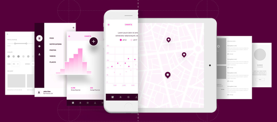
Design a Mobile App
Follow the link above to bring you to a set of tutorials to show you how to create your own Mobile App.
You can also open Xd on your computer and follow the tutorial there. It may be best to do both.
You will need to download the "Wireframe kit" to help you with your design.
When you open XD on your computer you will be prompted to follow a beginners step by step tutorial that you need to walk through to understand the basic process.
From there you can build your own by using the "wireframe kit".
You will need to decide what size format you will work on. I suggest keeping it simple at first and if you get in the groove then build away.
Project 1
PROJECT BRIEF
Re-design 3 U.S. currency notes (front and back, 6 total layouts). Use a subject/theme that’s different from the current focus on past presidents. The subject can be nature, a social issue, a historical event or anything you think would be appropriate for the format. Your ‘target audience’ is the entire country so your design should be nationally recognizable.
LEARNING OBJECTIVES
- Research and develop an alternative themed identity solution for an existing design.
- Use Illustrator as the primary design tool to practice re-working existing forms into powerful visual messages.
- Create consistency across multiple pieces of visual collateral.
- Apply the Principles and Elements of design.
- Rationalize design choices as they relate to the client and target audience.
- Exercise professional practices.
Present mounted and printed work to an audience.
DELIVERABLES
Students will submit:
- Six color or black and white prints (3 bill faces and 3 bill backs) mounted on 15" X 20" black mounting board
- One color or black and white printed bill decoder sheet designating the features of the currency design and their uses.
- One resource pack containing all R&D requirements: (word list, sources with notes, image inspirations and sources, all original or scanned/printed thumbnail and rough sketches and all printed comps).
- One 2-page min. rationale describing the design solution. Include details on the currency, the client, audience and your experience and reflections designing this project. Use the Principles and Elements of Design vocabulary we have been learning in class.
- Original Illustrator files used for the final currency and bill decoder designs.
READINGS/RESOURCES
U.S. Bureau of Engraving and Printing site
Banknote World: Compendium of International Currency
The
Dollar Project: A Wordpress site looking at the re-design of US Currency
CBS News link of the Dollar Project
REFLECTIONS
The goal here was to provide students with a capstone project for the course which integrated all of the tool skills, principles and elements of design as well as the design process from concept to delivery. This project also serves as an introductory assignment to the next level course in the curriculum which is our GDSN 165: Branding & Identity Design course. We find this project works well engaging and challenging students on a variety of levels. The one challenge we've experienced is in students clinging too closely to existing imagery and styles and not exploring more conceptual and creative possibilities. These students are still in the minority as most of the project results are considerable departures from existing forms.


Project 2
Deign in 3 Dimensional Space
Cut through window design.
Four 4x4 art boards
Each art board will have its own design that will also relate the other three frames.
These will be stacked on top of one another so the relationship between them will allow the viewer to see through the design and see the consecutive layers and their designs.
Each “layer” must have a 1/2 inch border You can achieve this by creating a 4x4 art board and a 3.5in square in the middle. Lock the square so it will not move later.
There will be an additional spacer between each layer to spread the depth of the finished project.
Using lines or basic textures on each layer could help to create depth and separation between them.
You will need to pay attention to positive and negative space.
Each Layer will be cut out using the Glowforge laser cutter. so the edges will be almost black as well as the textured lines you may use for details. So plan accordingly.
In order to keep things organized create a new layer for each art board as well as a new layer for each section of the design. For example any area that will be cut away should be on one layer and maybe filled with a specific color like blue. Secondly if you do choose to use lines as texture marks have them in a second color like red. This will help the organization of how the Glowforge will cut or score.


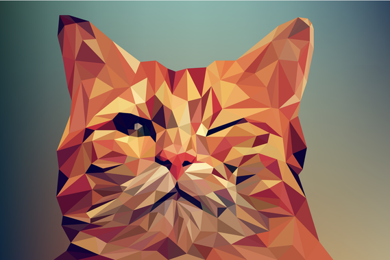
Low Poly Image
This is a fun project to turn photos of objects into geometric "Poly" designs.
Take a look at the tutorial and try to create 2-3 images.
Try to do different subjects; maybe a portrait, landscape or animal etc. Your choice.
Think about the color pallet you use. it does not have to be the same colors of the object itself but it can .
Do a search to see what others have done for inspiration.
Assignment 3
Design Brief
Kinetic Typography Song or Info Graphic
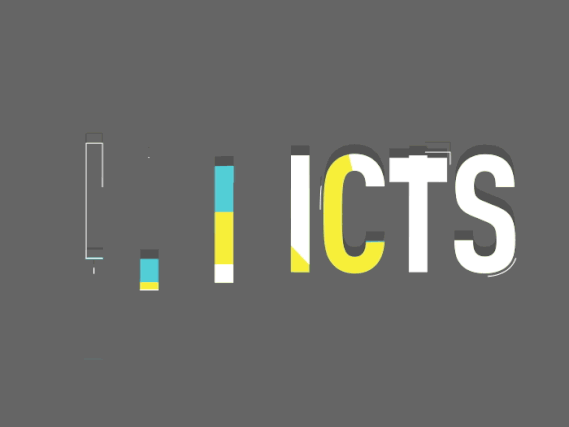
Using Adobe After Effects you are to create a Kinetic Typography piece. You can either illustrate a song or create an info graphic.
Either one should not be less than 90 seconds or more than 3 minutes.
This is a pretty time consuming process and will take some planning.so be sure it is what you wish to work on!
Take a look at how these are used in advertising and other graphic uses.
Take a look at this beginners tutorial on After Effects.
It is a little long but can cover quite a lot of information.
Before you begin working on the computer I want to know what your project is going to be about and a sketch or written description on what it will include. You do not have to write out every single work but a general synopsis.